23 Jul 10 Examples of Awesome B2B Landing Pages via @alexanderkesler
There is no single formula for a perfect landing page.
Each one is unique, and while best practices help to focus the creation process, the right approach will – and should – always depend on six things: the who, the what, the where, the when, the why, and the how.
Essentially:
- Who is the audience?
- What is the desired action for the audience?
- Where does the landing page live?
- When will the audience see the page?
- Why will the audience see the landing page?
- How will the audience arrive at the landing page?
Every B2B marketer will have different answers to those six questions.
As a result, every business will take a unique approach in order to bring its audience along the journey of becoming a prospect and, eventually, a customer.
I’ve highlighted ten companies that I think are producing great landing page experiences for different reasons.
Each example represents a unique approach with its own merits and offers inspiration for B2B marketers.
10 Examples of Inspiring B2B Landing Pages
1. Slack
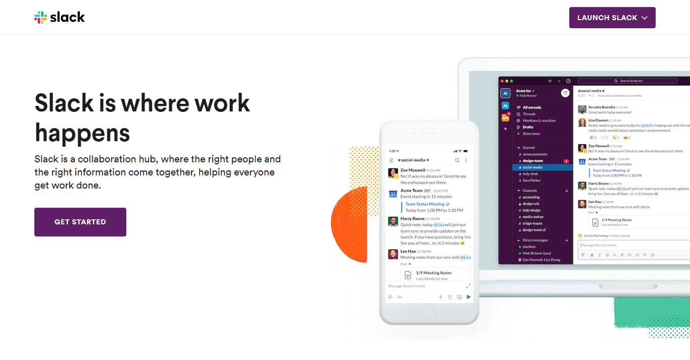

Slack’s landing page employs many common best practices but adds up to a whole that is greater than the sum of its parts.
Bold and direct headline, strong supporting subheading, simple single-field submission form, and attractive hero image – all above the fold.
Slack is also able to leverage an impressive client list.


Scrolling below the fold reveals logos for industry leaders like Airbnb, EA, TD Ameritrade, Oracle, Target, and AutoDesk. These are key trust factors.
Further down the page are rich descriptions and images of some of the platform’s most important features.
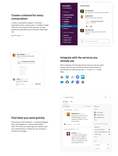

The integrations section is notable, clearly addressing the versatility and adaptability of Slack.
2. LogMeInRescue
LogMeInRescue provides a crystal clear value offering for this landing page experience.
The content here is entirely focused on illustrating the value of this remote support solution.
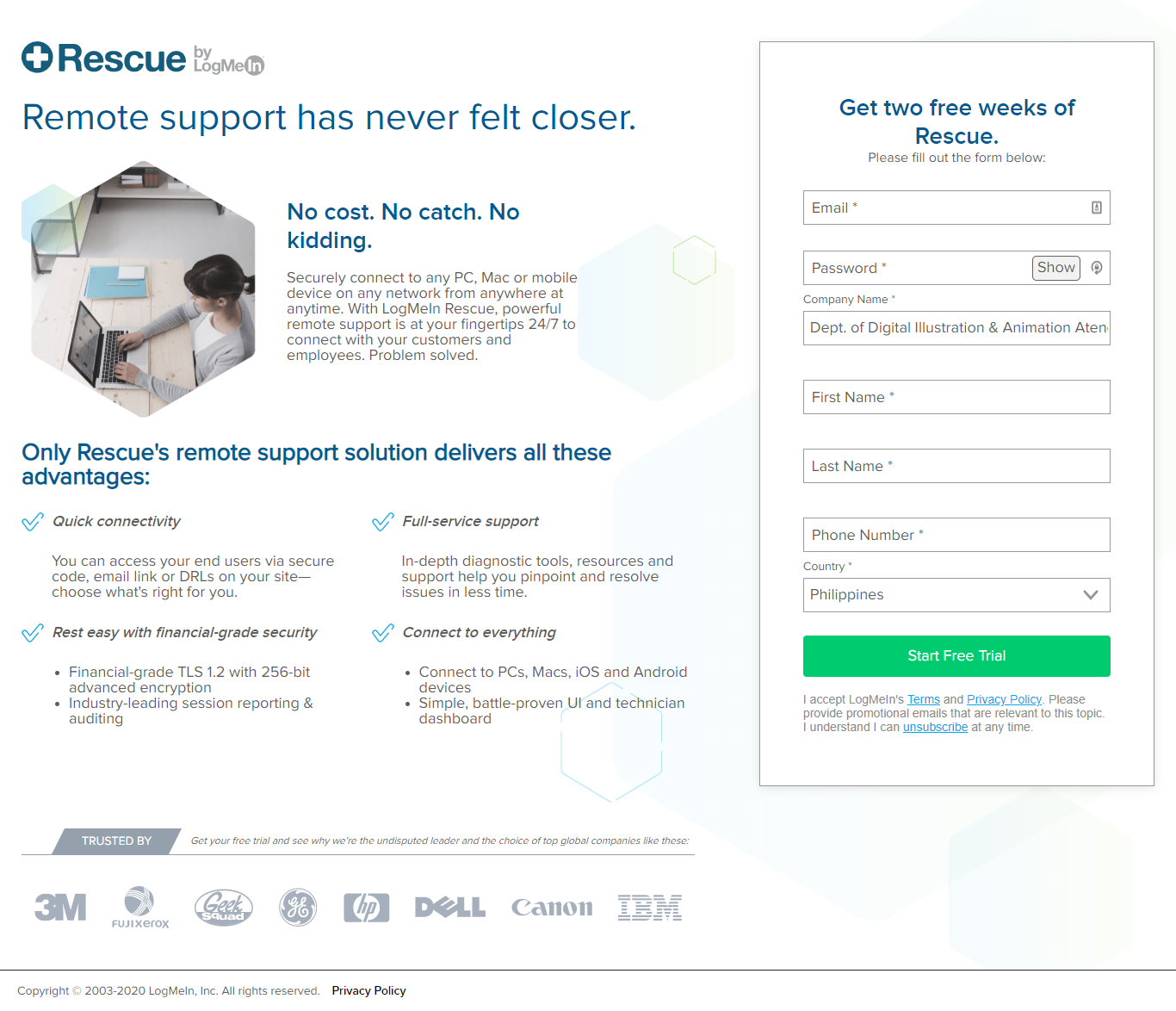

Little space is used for providing context, rather the focus is on elevating the unique selling points of connectivity, support, and security.
Even trust points are demoted to the foot of the page, with the effect of highlighting the intended conversion path via the lead form.
3. Automation Anywhere
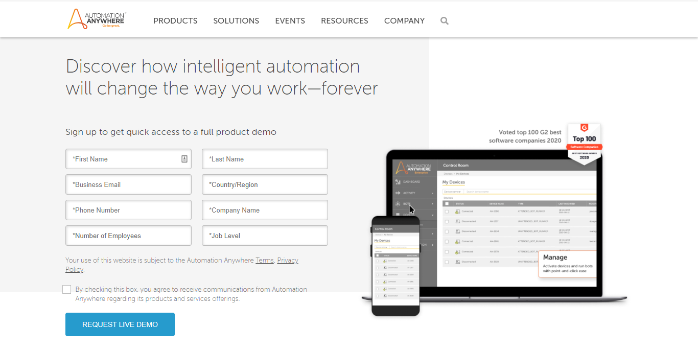

Automation Anywhere provides end-to-end RPA and other services to automate any business process.
The conversion goal of the landing page is clear: lead generation through offering a demo via a submission form.
This is a great example of how a longer submission form can be effective.
Asking visitors to submit too much information creates resistance and increases the chance they bounce from the page without converting.
A multi-field submission form must be appropriate and relevant to the value offering.
Automation Anywhere is offering a demo for an advanced business automation software, a product that warrants more than just an email from the visitor, so each of these fields is vital.
4. Auth0
Auth0 provides a good example of a demo page being used as an effective landing page.
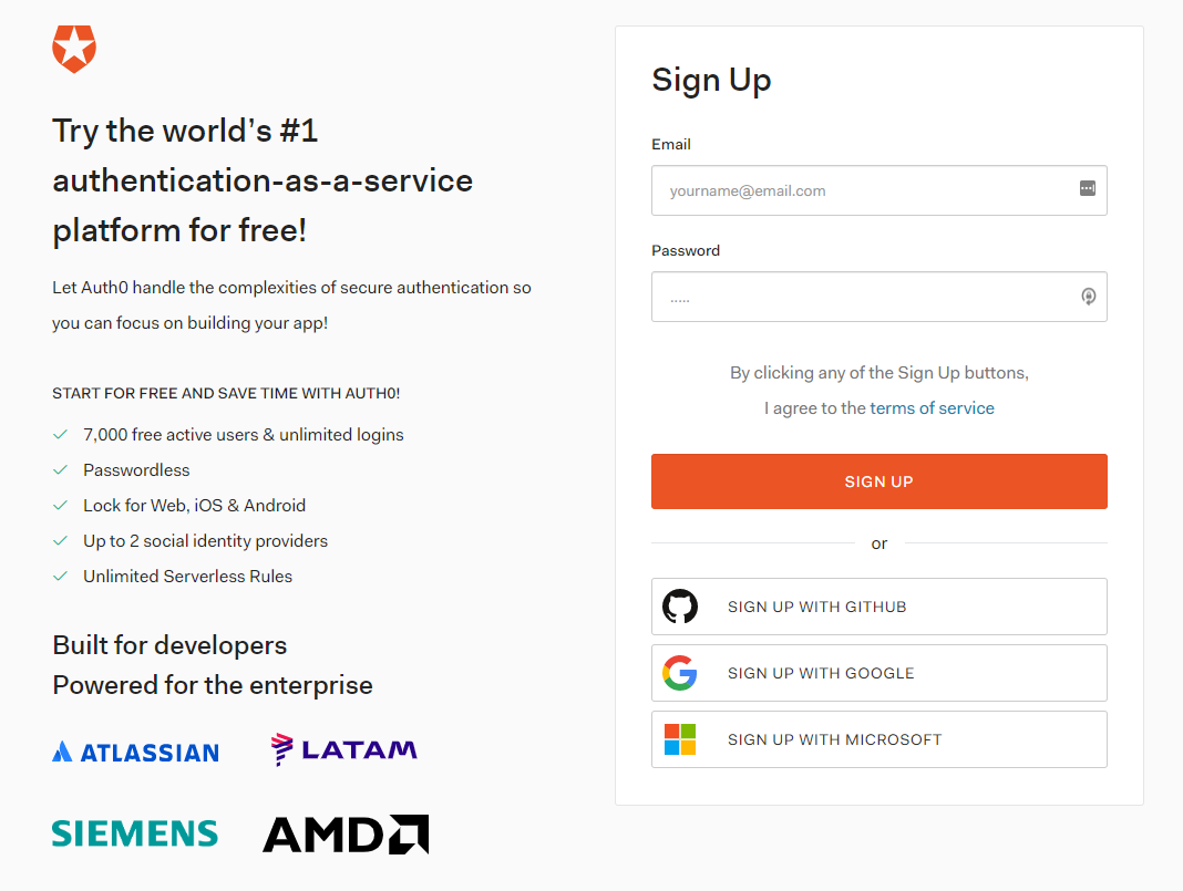

The key here is minimal friction.
The area above the fold employs a less is more approach – with only a headline, key information, and a two-field submission form and sign-up options.
Again, client logos provide the trust factor.
5. Alkami
Alkami provides digital solutions to institutions offering retail and business banking.
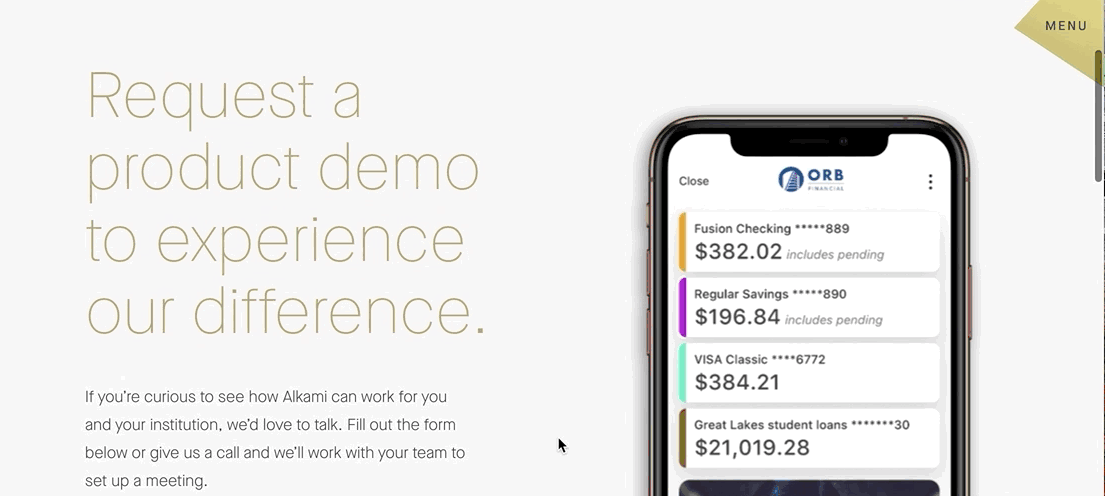

This is a clear and compelling brand and design. It is easy for visitors to focus on the conversion goal, requesting a demo of the software.
The featured image provides an up-close look at the software in action on a mobile app.
The signup form is the appropriate length, asking for first name, last name, email, and company.
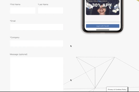

Users are not tempted with distractions as there is limited text and the menu is collapsed and subtly buried in the top right corner.
6. Asana
Asana is another example of a landing page that effectively applies the “less is more” philosophy.
The area above the fold only contains a headline, some subtext, and a CTA button.
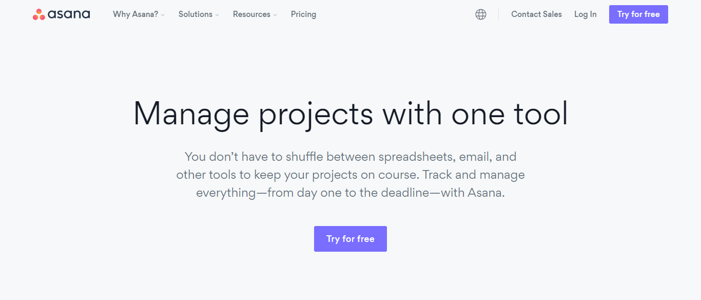

Clicking the button takes visitors to a page with a single-field submission form, used to create a free account.
Further down, Asana enhances the page by providing detailed benefits of the offer they are promoting.
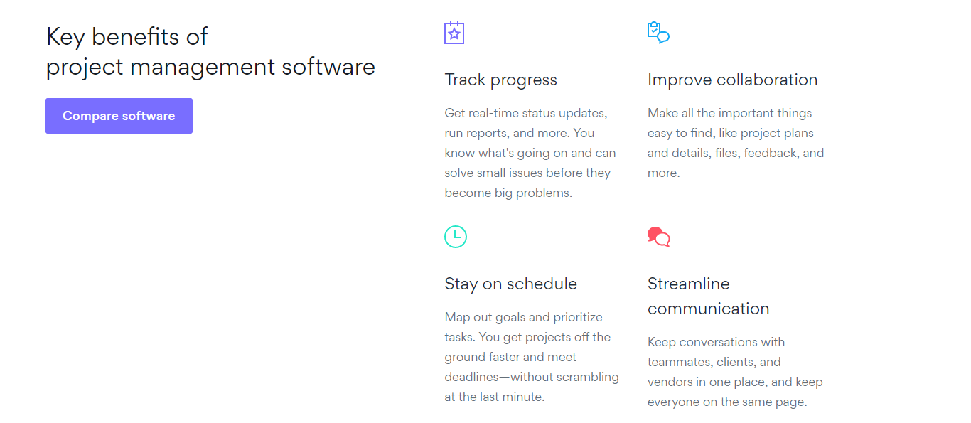

Visitors get an insight into all the ways the project management software can improve productivity and organization over the 30-day trial.
7. Armor
Armor is a global cybersecurity company helping organizations to simplify the protection of data and comply with regulatory frameworks.
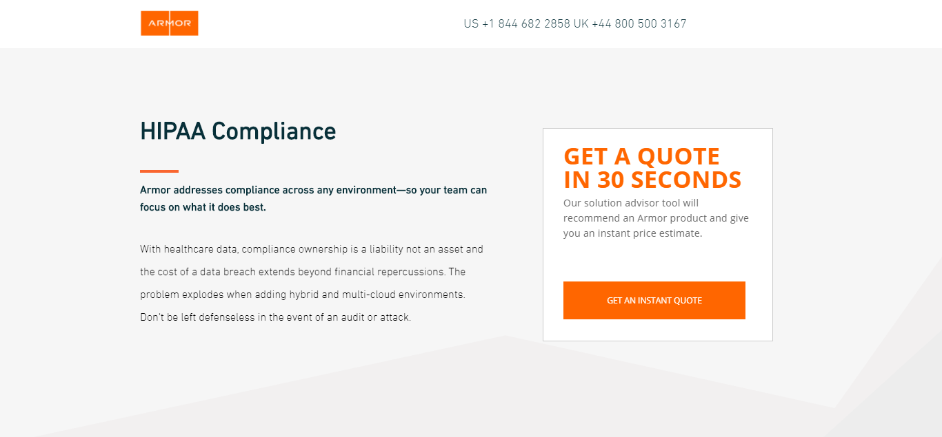

The message of the page is unmistakable: users can request a quote in a matter of seconds.
Armor makes it easy for visitors to learn even more about the service with multiple contact options that are easy to see.
There are phone support numbers in the header and a helpful chatbot in the bottom right corner.


8. Persistent Systems
Persistent Systems uses several effective tools to persuade visitors to request a demo.


The area above the fold is clean with only a hero image, headline, and a call-to-action button.
Clicking the call-to-action button sends users to the signup form located at the bottom of the page.
Underneath the fold, visitors can learn more about the service via a video and a list of features, relevant stats, and testimonials.
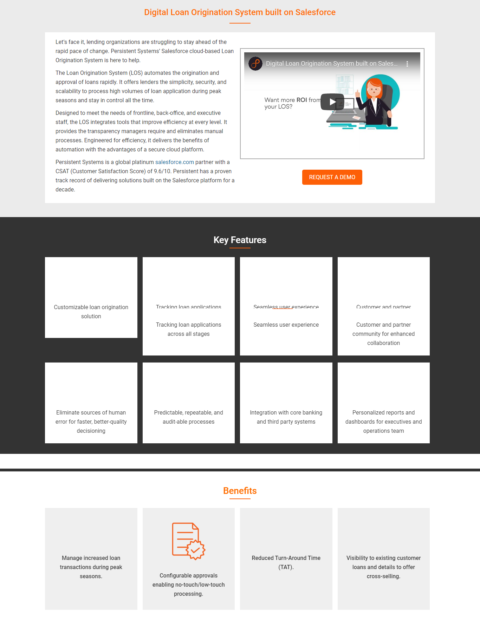

These elements help clearly illustrate the benefits that prospects stand to gain by using the platform.
9. DocuSign
DocuSign balances different landing page principles to create a conversion ready page.
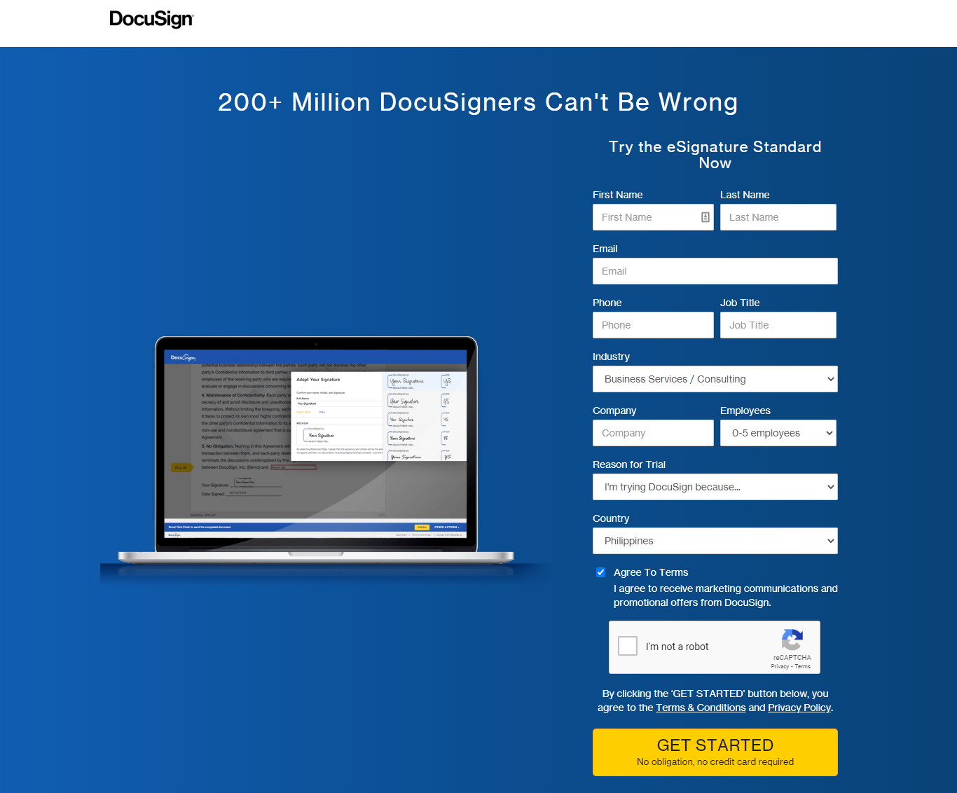

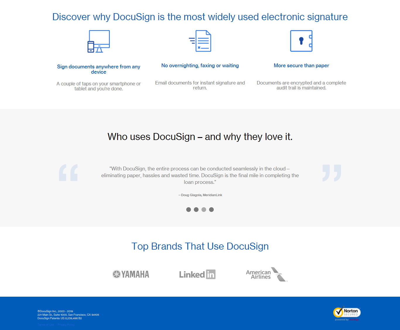
The content is bold and communicates the enormous popularity of the solution – a massive trust factor.
The page is clean and easy to navigate with ample whitespace between the headline and hero image.
Visitors are not presented with unnecessary distractions as there is no navigation menu on the page.
The only exit link is the header logo, which opens in a different tab.
The longer submission form works well because the rest of the page is so refined.
Anyone hesitant to fill out such a long submission form need only scroll down to find reassurance from testimonials and notable customers such as LinkedIn and American Airlines.

10. HireVue
HireVue takes a different approach than others on this list.
Instead of a hero image with an up-close display of the product, this landing page features a video in the prominent position above the fold.
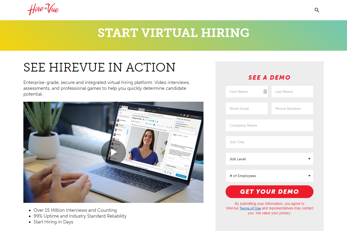

The video provides a dynamic first-hand look into the platform and is a good fit for the page.
Landing page videos need to be short and have a clear CTA.
Scrolling down the page, HireVue uses precise numbers to highlight the benefits of the platform, highlighting the number of interviews performed and the reliable 99% uptime.
Takeaways
At a time where it is increasingly important to hold people’s attention online, landing pages need to be easy to process and allow for quick conversions.
Here are some things to consider when designing a winning landing page.
Make Headlines Compelling
The headline is the first thing visitors see when arriving on a landing page.
Often, it is the only thing they read before deciding if they are interested in a value offering.
Headlines should be bold, direct, and descriptive.
Use Ample White Space
White space helps to make a page easy to navigate and process. Too much clutter and content can scare leads away.
Effective use of white space can also help draw attention to specific elements like a CTA button.
Make the CTA Stand Out
A strong CTA is at the crux of any good landing page and needs to stand out from other elements on the page.
Make the CTA eye-catching by using contrasting colors for buttons and assuring it is not too small.
Another effective approach is to avoid using standard and boring copy like “Subscribe” or “Download”.
Instead, make the copy more conversational to improve engagement and increase conversions.
Emphasize Trust Factors
Performance metrics and third-party endorsements can help boost credibility and lower the resistance to conversion.
Leverage Customer Testimonials
Potential customers will always look to their peers to learn the value of a product or service.
Testimonials are a powerful conversion tool as they provide insight into the customer experience.
A quote and a logo are also easy to scan and absorb.
A/B Testing
Regular A/B testing will help to maximize conversions. Every audience and every offer is different.
Test variations of copy, the position of the offer, colors, and form fields to understand impact on usability.
Remember: no matter how good the landing page is, it can always be a little better.
More Resources:
- 7 B2B Marketing Trends to Embrace
- B2B Content Ideas to Generate Links & Industry Influence
- 5 Brilliant Ways to Combine Traditional & Digital Marketing
Image Credits
All screenshots taken by author, July 2020
Sorry, the comment form is closed at this time.