29 Sep 25 of the Best Examples of Effective FAQ Pages via @LWilson1980
Frequently asked question (FAQ) pages (or hubs) help your business respond to the needs of your audience more quickly and appropriately.
An effective FAQ resource can educate, inform, and guide the user in a natural way through your website’s content and toward the goals and end results you have set.
In fact, an FAQ page is an essential webpage to have on your site.
Why?
Because FAQ pages can bring in new visitors to your website via organic search and drive them to related pages – most typically deeper blog pages and service pages closely related to the questions being resolved.
The FAQ page is one of the best ways to help people visiting your site.
They will get their intended destination faster because you are removing any possible knowledge (informational and often trust) barriers.
Why FAQ Pages Are a Priority
FAQ pages continue to be a priority area for SEO and digital marketing professionals.
An FAQ page is one of the simplest ways to improve your site and help site visitors and users.
In no small part, the importance of FAQ pages has been driven in recent years by the growth in voice search, mobile search, and personal/home assistants and speakers.
These predominantly rely on the pre-results (Google Answers and Featured Snippets) and can be targeted specifically with FAQ pages.
An effective FAQ page:
- Reflects your audience’s needs.
- Covers a broad range of intent (transactional, informational, etc.).
- Frequently gets updated based on new data insights.
- Lands new users to the website by solving problems.
- Drives internal pageviews to other important pages.
- Fuels blog (and deeper content) creation.
- Showcases expertise, trust, and authority within your niche.
Now let’s look at 25 great examples of FAQ page/resources, as well as why they’re so effective.
1. Twitter
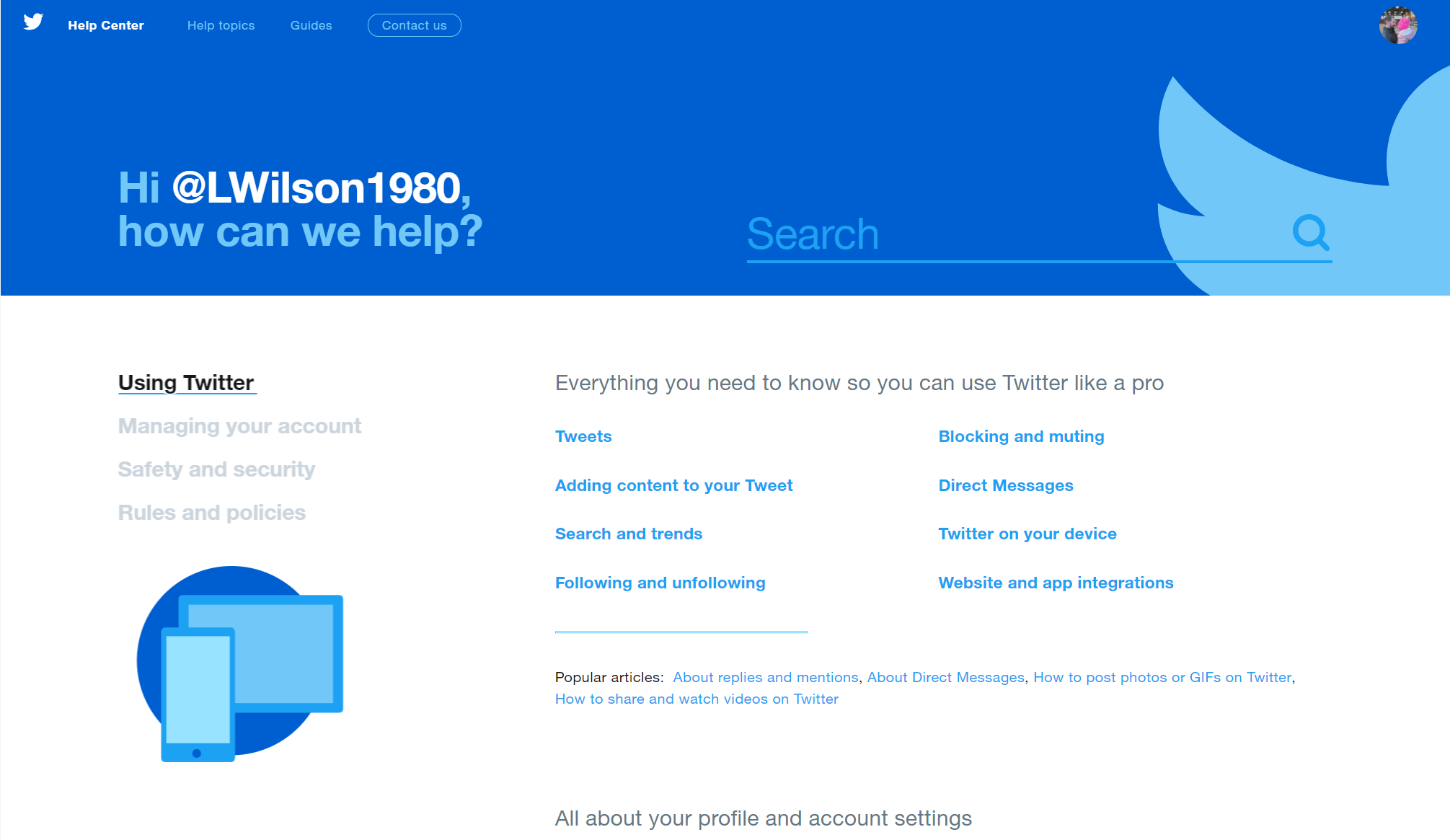
Twitter’s FAQ made the list as it includes some nice personalization, easy to use search functionality, and it looks nice (something that few FAQ pages ever achieve).

2. YouTube
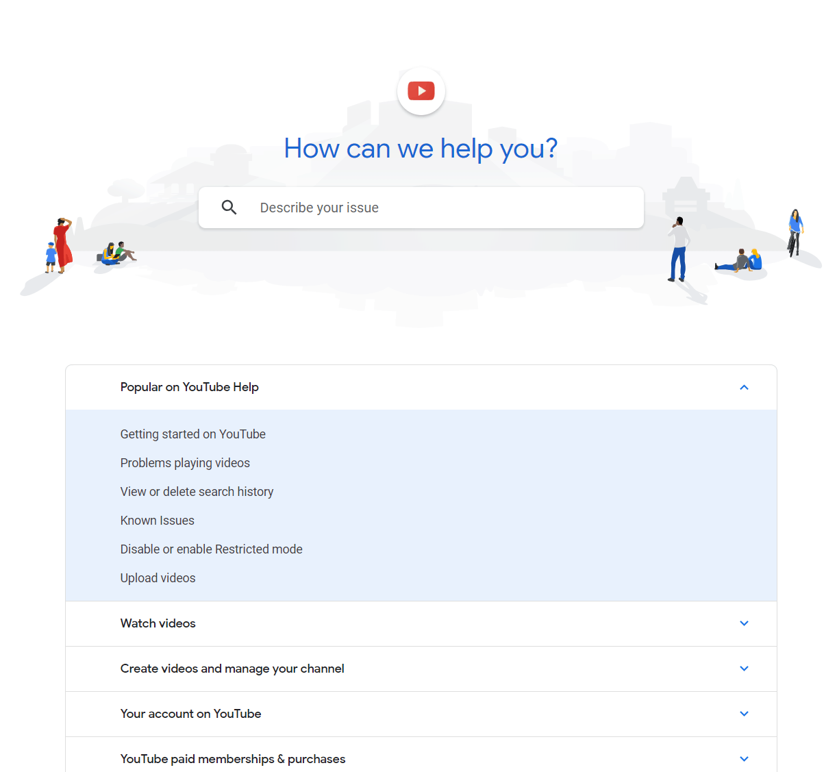
YouTube’s FAQ page is clean, fresh, simple to use, and provides access to the most commonly asked “help” topics.

3. McDonald’s
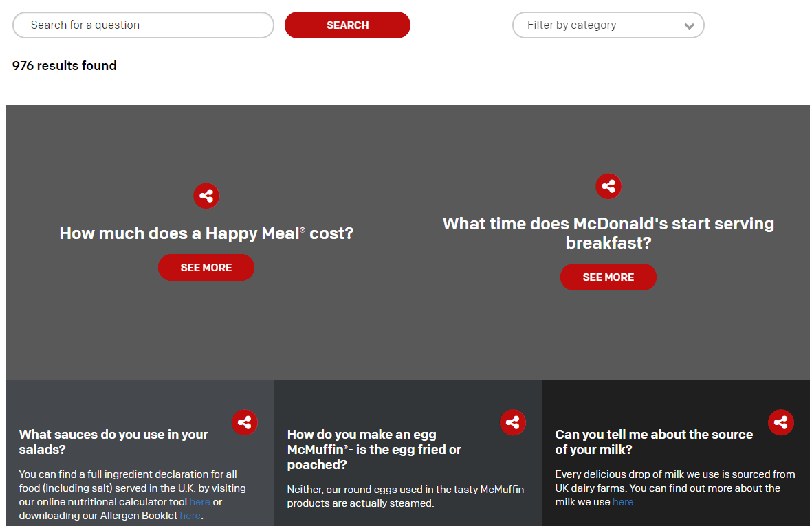
The McDonald’s FAQ page feels informal, sociable, and encourages people to share their FAQ experience (a rarity).

4. WhatsApp
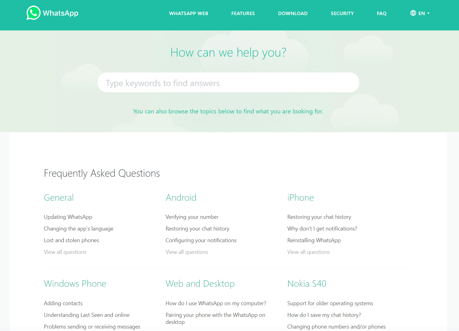
The FAQ resource for Whatsapp is bright, easy to use, and categorized effectively for quick desktop or mobile use.

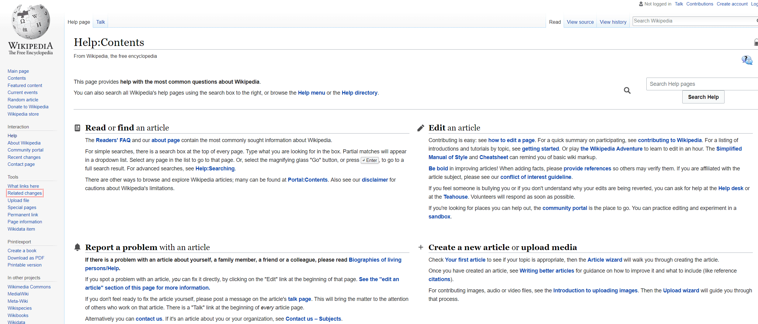
5. Wikipedia
Wikipedia’s help center is a great example of an “old-school” FAQ page.
It is text heavy, blocked into key topic areas, and has extensive access to all the key support areas you could ever need.

6. Microsoft
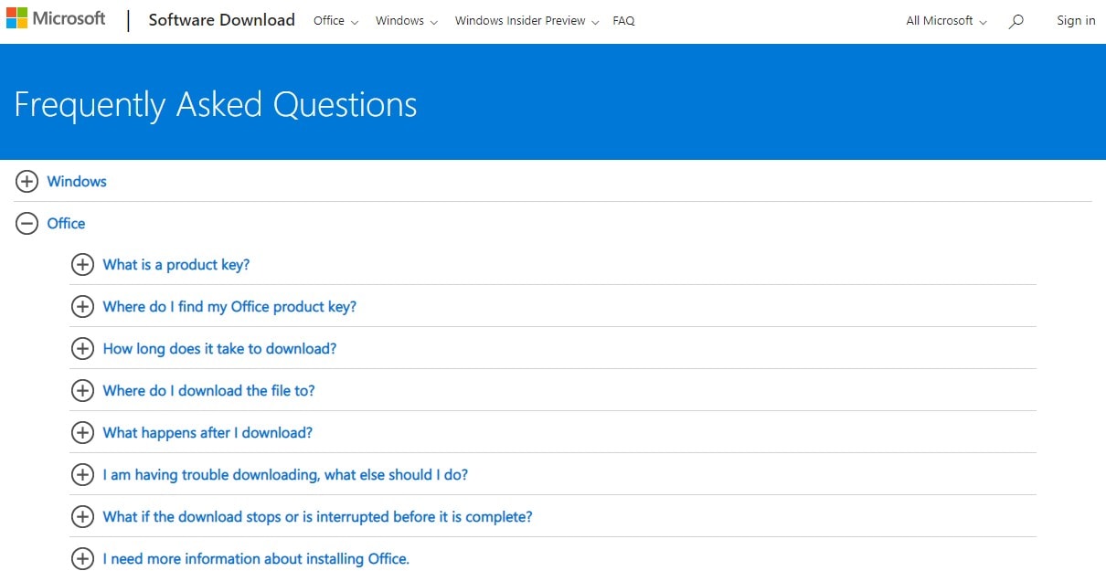
Microsoft’s FAQs section employs accordion/expandable div functionality to enable a more effective mobile-first experience and to support quick top-level access to information without excessive scrolling.

7. UCAS
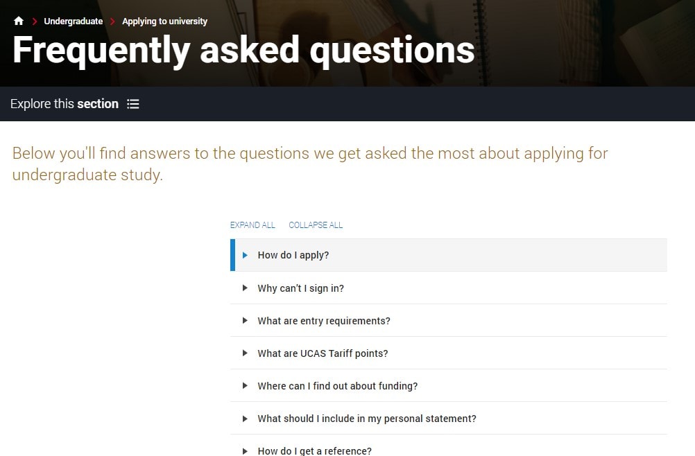
The FAQs section of UCAS is simple, scaled back, and concise.
It also includes a useful prompt to ask if the information was useful and to gather user feedback for improving the resource.

8. WorldFirst
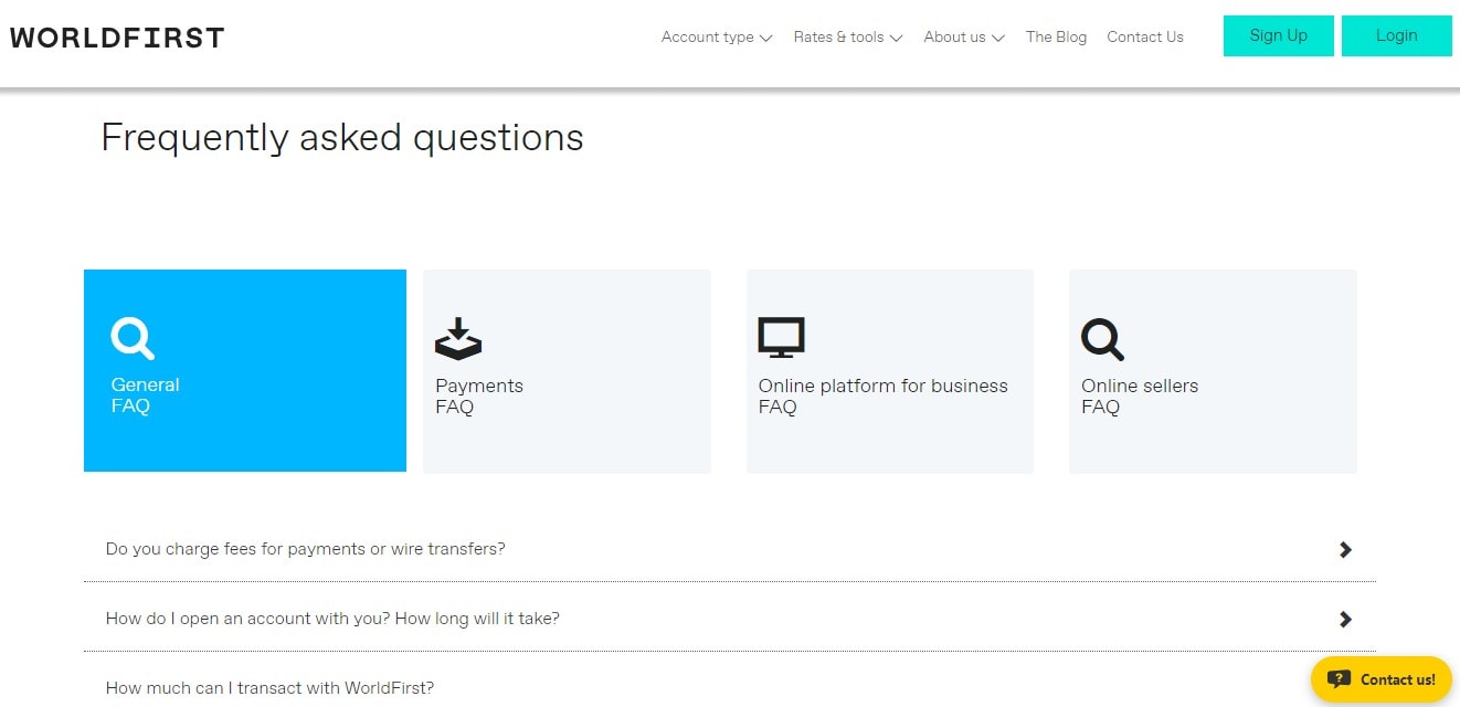
WorldFirst’sFAQs hub provides single-click content segmentation, plus view all capabilities which place functionality and usability of the resource first – an important part of an effective frequently asked questions resource.

9. Nintendo
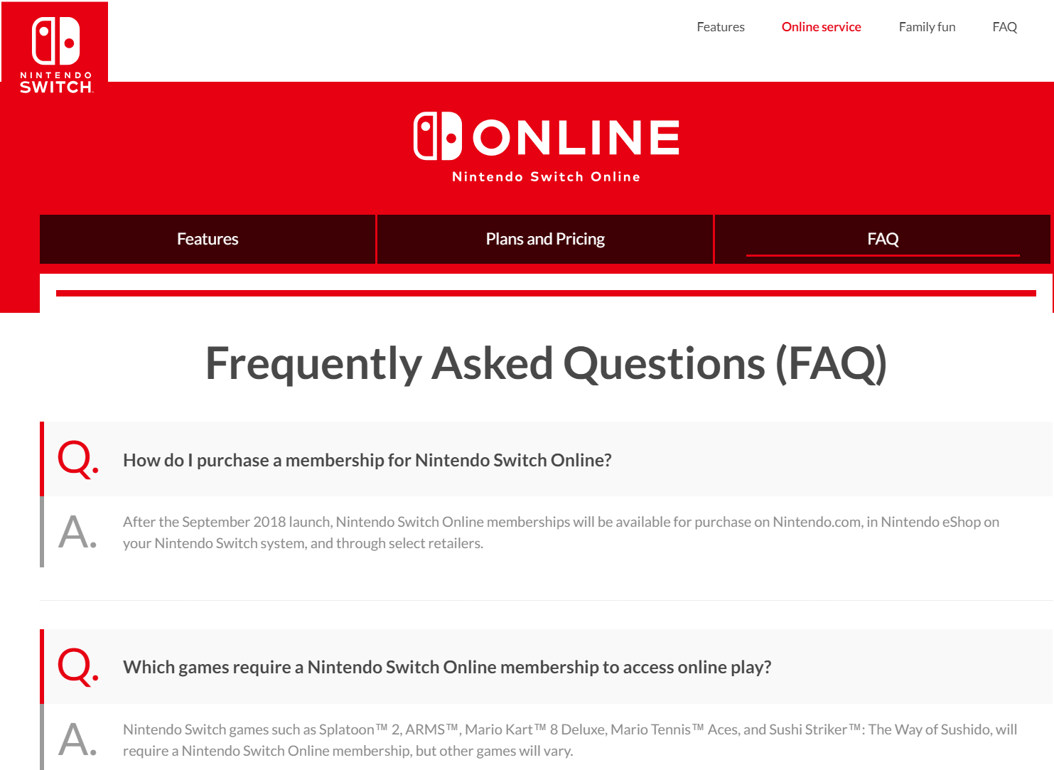
The Nintendo Online FAQs are bold, functional and simple in approach.
The content isn’t cluttered and easy to skim read.

10. DaysOutGuide
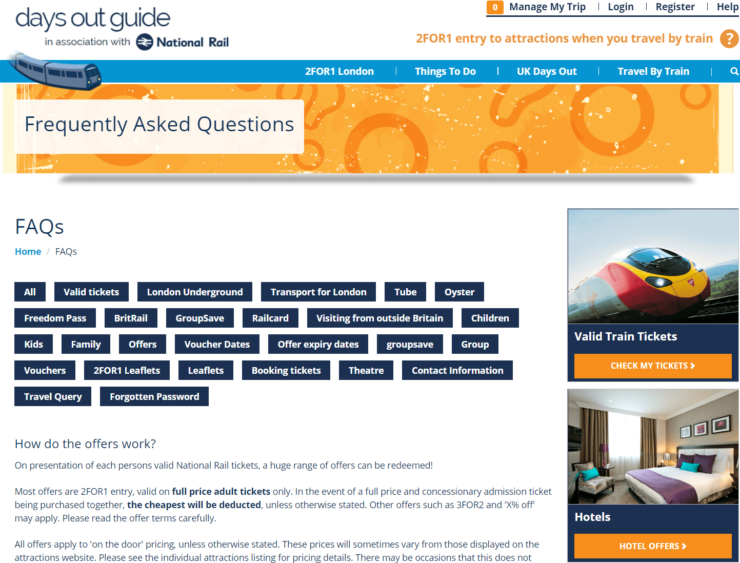
DaysOutGuide’s frequently asked questions resource incorporates tags to make the most out of single-click functionality for all device access to information.
The balance between text, images, and interactive features works great.

11. Buffer
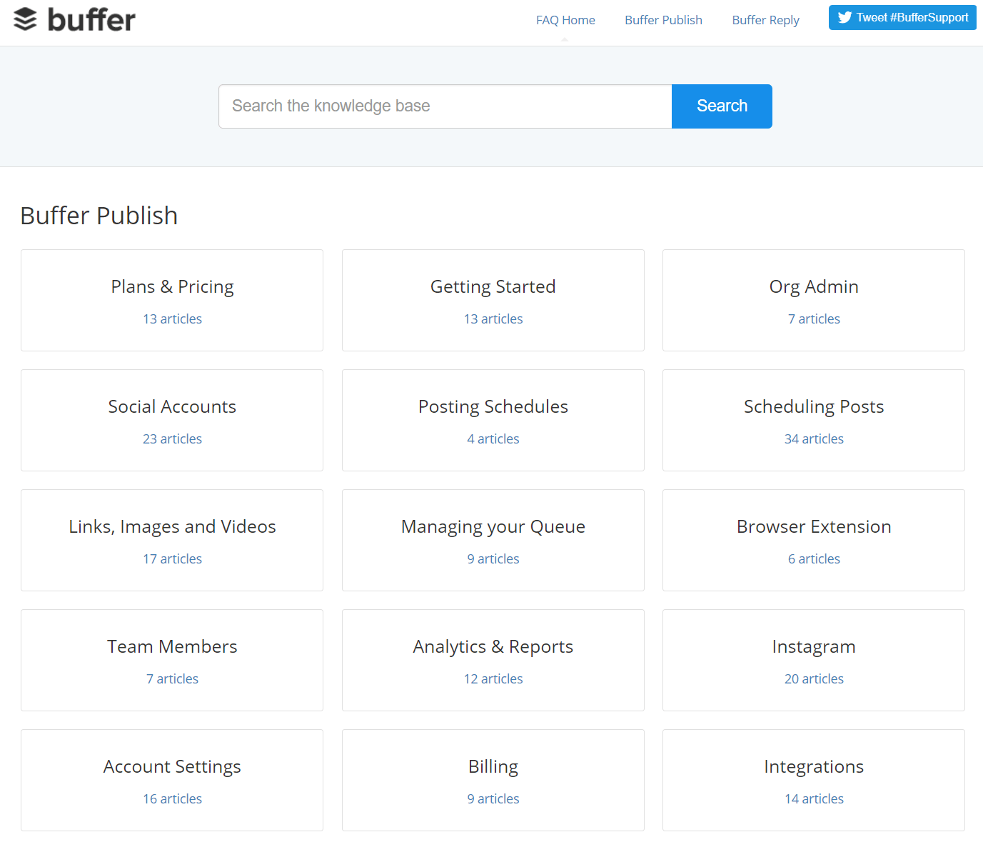
Buffer’s FAQs are by far the most basic by design (single grid defined by thin square categories) included in this list of my best and most effective FAQs, but they work.
The small inclusion of the number of articles available within each topical section also provides an added reason to delve in and learn more.
It’s a simple solution, but almost always overlooked.

12. FreeSpirit
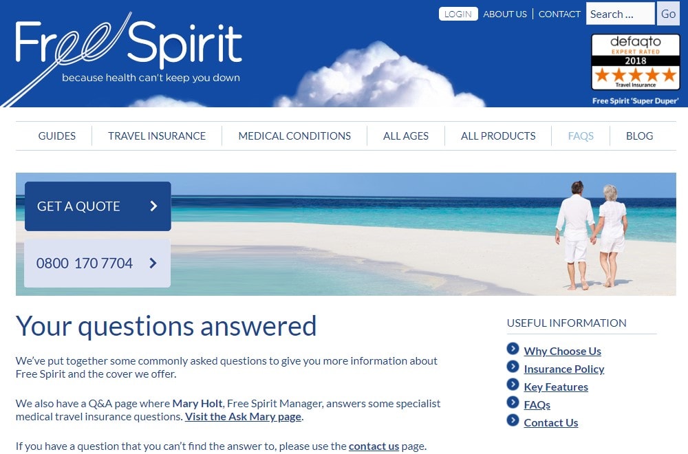
The FreeSpirit FAQ page combines useful information navigational features with interactive content to empower the user to progress through the site and making buying decisions faster.

13. Amazon Web Services
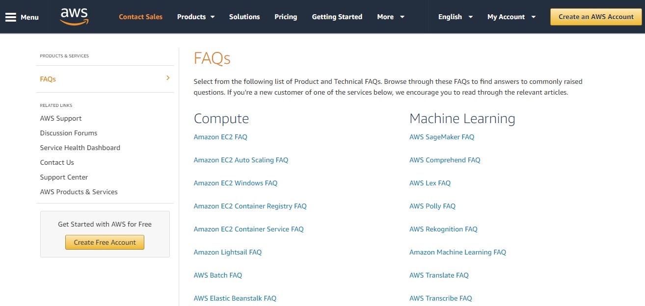
Amazon Web Services’ FAQs are functional, easy to skim through, and categorized for use.
There are no frills here.
But, in some cases, it’s better to get straight to the point.

14. Silicone Engineering
Silicone Engineering’s FAQs help demystify a traditionally complex industry.
The combination of quick links, ask the expert, and deeper content answers work well for the user regardless of time availability or device used.
![]()
![]()
15. Dropbox
Dropbox Help brings fun to the FAQ area with the choice of images used and encourages the user to experience the site through self-discovery.


16. TUI
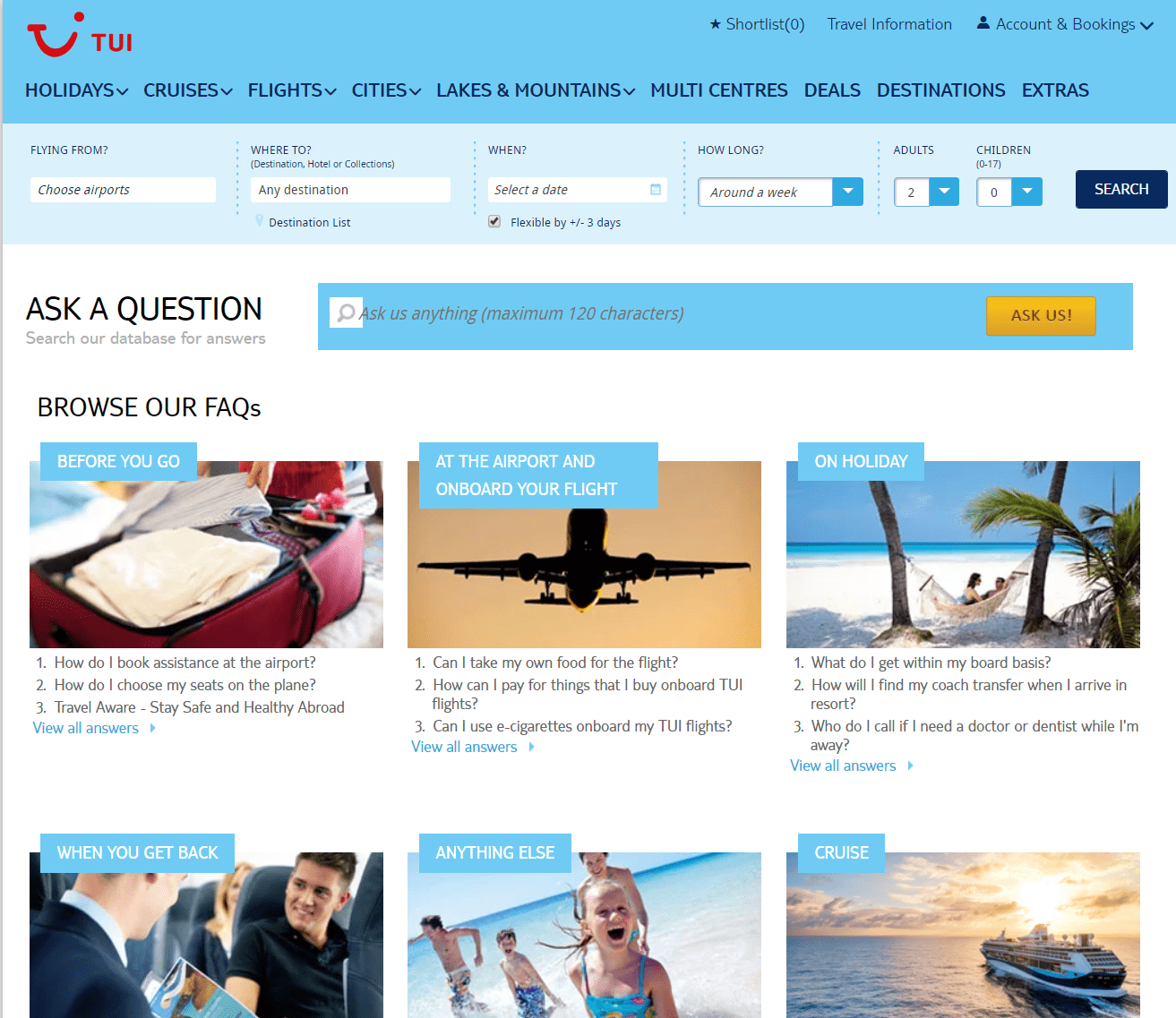
TUI FAQs are in a grid format, include depth of topical coverage and reflect the volumes of information available on the site.
The resource is not very pretty by design, but it works and almost has a retro feel to it.

17. MetroPCS
The MetroPCS FAQs page includes a virtual chat assistant which leverages the FAQs above the static functionality of most.
Chatbots are ideal FAQ considerations mainly based on the ability for them to expedite and drive the user journey (a key effectiveness area for any help and FAQ resource).


18. Transpack
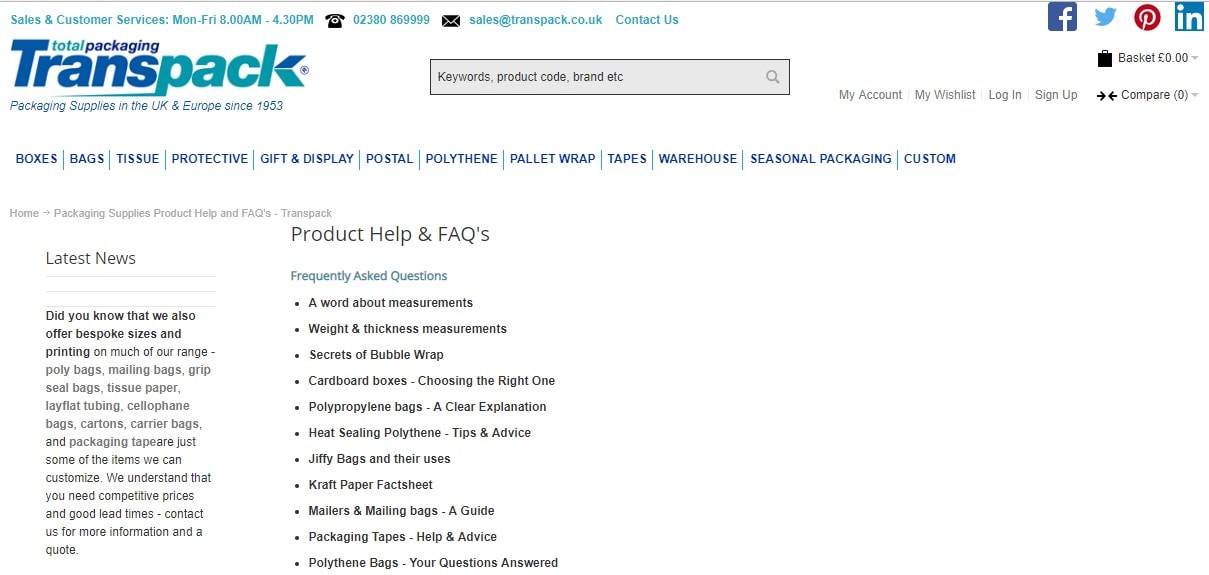
The Transpack Product Help Center acts as both an FAQ resource as well as a guides roll-up resource, meaning that users can access top-level information as well as buying guides, measurement information, and a whole host of other insights normally only accessible through blogs.

19. FatFace
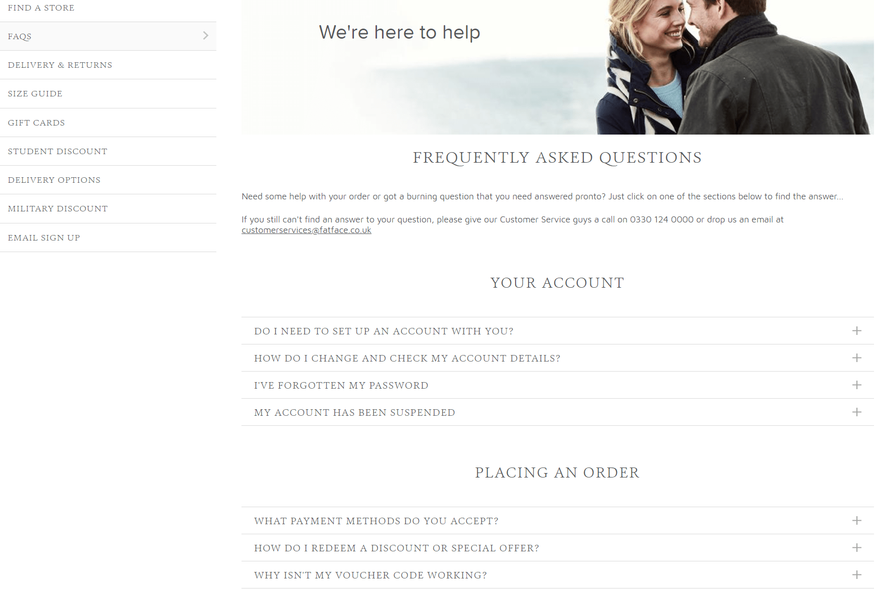
The FatFace help center and FAQs resource is a nice example of a bigger brand getting it right.
The help center places the users first with the topics covered and still manages to feel personable and helpful.

20. King’s College London
King’s College London’s FAQ page is divided into FAQ sections per key area of the website. This enables highly targeted support recourses that are driven by a single purpose (often facilitating easy applications).
The segmentation of FAQs is what stood out and led me to include them in this list.


21. Pinterest
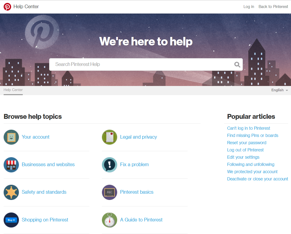
Pinterest’s Help Center takes simplicity to the next level.
The design and information provided are clearly prioritized for the mobile user combining visual and textual triggers.

22. Elite Island Holidays UK
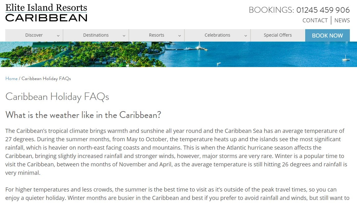
Elite Island Holidays’ FAQs are driven by audience needs and clearly set out to answer peoples holiday dilemmas from preparation through to last minute help and support.
The blog nature of the answers means that the site visitor doesn’t need to travel beyond the FAQs page for help.

23. BBC
BBC’s Help Section is fun, visually driven, and even provides useful information on how to use the FAQ section.
Making a help resource fun isn’t easy, however, the BBC has achieved this.


24. Pretty Little Thing
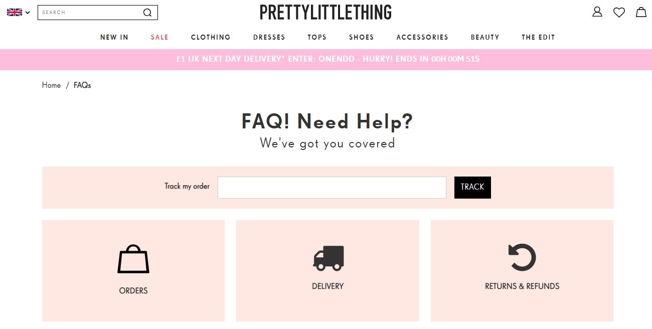
The FAQs on Pretty Little Thing tells you their audience immediately and position the design and content accordingly.
The FAQs also appear well thought out and enticing to interact with.

25. Foresters Friendly Society
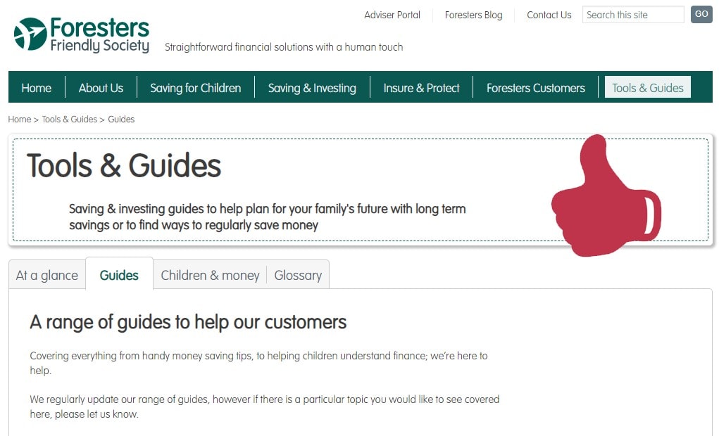
Foresters Friendly Society’s FAQs, Help Center, and Tools/Guide Resource bring lots of information-rich segmented guides and financial tools into a single place.
Making often complex and dry financial topics straightforward and accessible is not easy, but this section does it well.

More Resources:
- 25 Creative & Engaging Examples of About Us Pages
- The 10 Best Ranking Contact Us Pages on the Web
- 25 of the Best Examples of Beautifully Designed 404 Pages
Image Credits
Screenshots taken by author, September 2020
Sorry, the comment form is closed at this time.