19 Mar Facebook Redesign is Bold and User Friendly via @martinibuster
Facebook is unveiling a redesign of their website that is bold and user friendly. The new design also comes with a dark mode.
New Facebook Redesign
The new design uses a Cards design style, where different sections are contained within card-like containers.
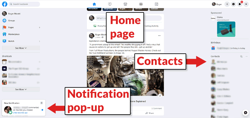
 This is the main Facebook home page. Navigation is discrete and the look is uncluttered.
The top icon-based navigation are for home page, watch, marketplace, groups and gaming. Along the left you can see text based navigation for groups, pages, marketplace and watch. More features like games, town hall, events and so on are available when clicking the See More icon.
Notification Pop-up
Notifications slide upward from the lower left corner, like push-style notifications.
Icon Style Top Navigation Menu
The top navigation is icon based. You have to hover over them to learn what they are for.
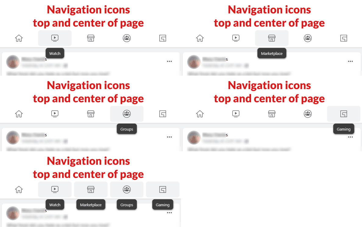

The top navigation encourages people to explore different areas of Facebook. The goal may be to build awareness of all the different things members can do on Facebook.
Facebook Dark Mode
Facebook enters the 2020’s with an up to date dark mode. Dark mode allows members to comfortably view Facebook while in a dark room.
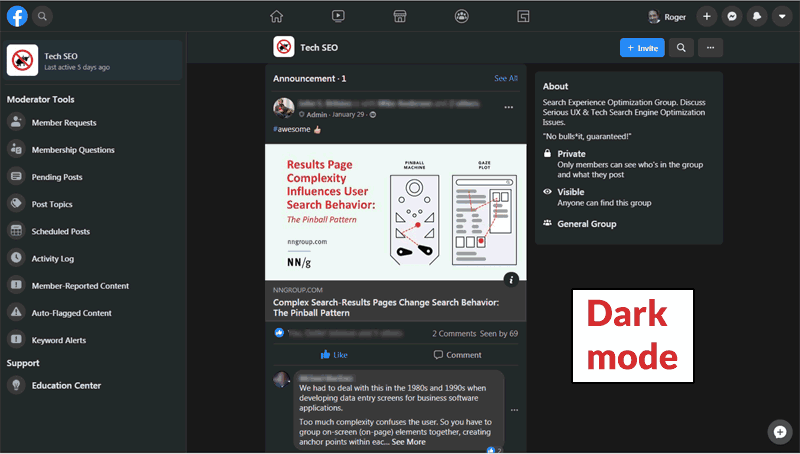

Above is a screenshot of a home page of a private Facebook group in the new dark mode. Something new and convenient are the Moderator tools on the left. Admins will see an Admin Tools section in that left hand area.
Close-up of Left Hand Navigation
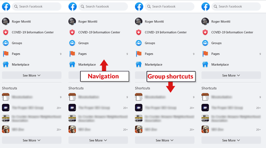
 New Facebook redesign, closeup view of the left hand navigation.
The left hand navigation area expands so that more groups and Facebook features can be exposed. It’s a great way to make all of Facebook’s popular features easier to access.
New Notification Area
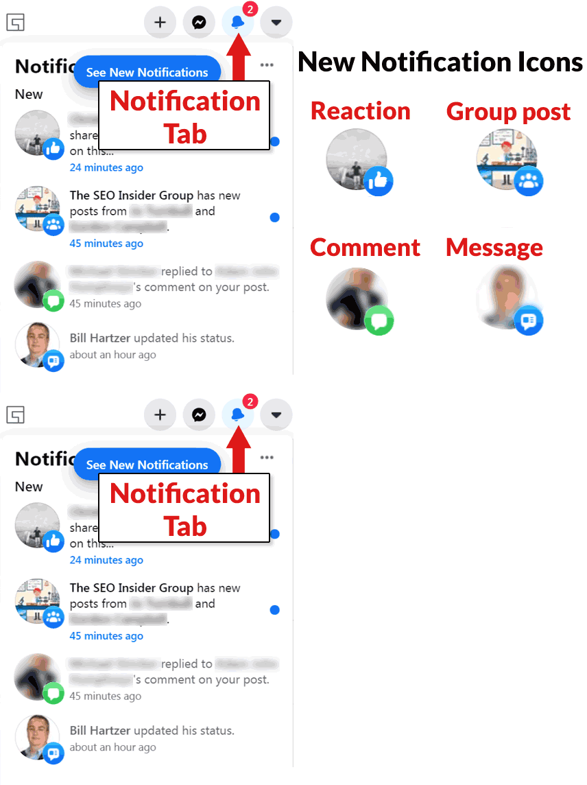
 This is a close up of the notification panel area, located in the top right hand side of Facebook’s new redesign
There are new icons to label the different kinds of notifications. There’s an icon for when someone comments on your post, when there’s a message, a reaction and a post in a group you follow.
Single Post Page
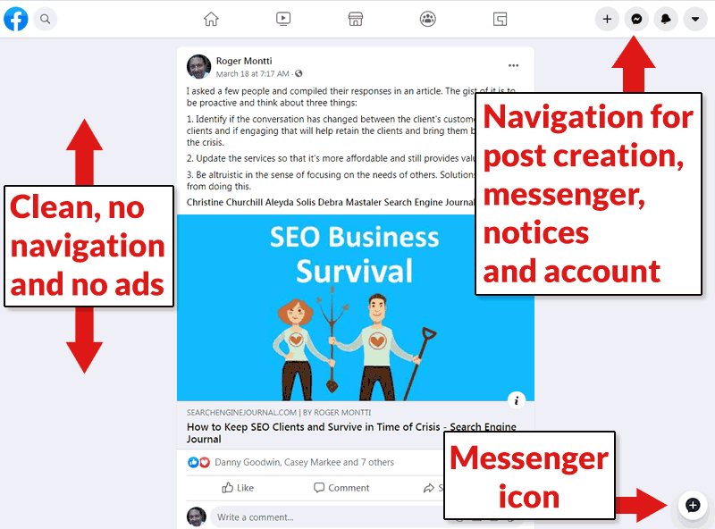

The is the layout for a page that is dedicated to just a single post. Notable are the lack of ads and no navigational elements on the left hand side. You have to click the home page icon to get those right hand navigational elements back.
Facebook Advertisements are Discrete and User Friendly
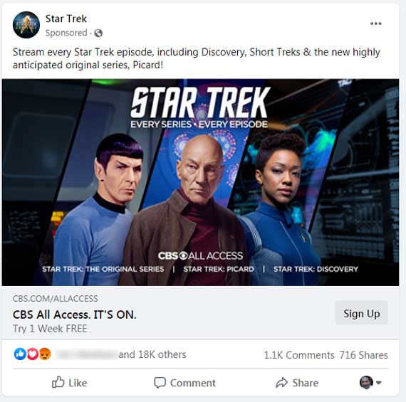
The advertising resembles a regular Facebook post. It’s discrete and unobtrusive. It blends in with the rest of the page and is attractive.
Takeaways
The new layout is user friendly. It doesn’t take long to get used to the new style of navigating the site. It’s more user friendly and encourages exploration of all the other features.
For admins and moderators Facebook has made it’s tools more available, which will encourage group leaders to do more with Facebook.
The advertising ad units are non-obtrusive and may provide a good user experience, which should be good news for advertisers as well as users.
Sorry, the comment form is closed at this time.