22 Sep Facebook Removes the 20% Text Limit on Ad Images via @SusanEDub
Media buyers in Facebook’s platform began to notice recently a big change: their images were no longer being disapproved for a lot of text.
When the Change Was Noticed
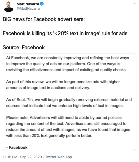
It’s been confirmed via a few sources the long-standing rule for Facebook Ad images being no more than 20% text has been sunset. Buyers started receiving direct communication from Facebook this week regarding this change:

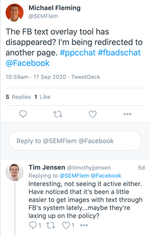
Prior to this communication, media buyers were noticing the text overlay tool page was redirecting:

At that time, no Facebook documentation had been updated, but this appears to have been updated in the past few days.
While it still gives tips on reducing text proportions in ad images, it now stops short of saying to keep it at 20%. Instead it now cautions the 20% metric as a best practice:


This is different than the previous verbiage, which is now gone:
“To create a better experience for viewers and advertisers, ads that appear on Facebook, Instagram, and the Audience Network are screened based on the amount of image text used in your ad. Based on this review, advertisements with a higher percentage of image text may not be shown. Please note that exceptions may apply to certain ad images. For example, exemptions apply to book covers, album covers and product images.”
The “20% Rule” Historically
The purpose of the rule originally was to reduce the noisiness in a Facebook News Feed. Especially prior to the multiple ad units and media options that exist now, the Feed was largely text and images. Adding even more text had the potential to make a more cluttered and overwhelming experience.
However, over time, the platform evolved. Text in an image was no longer the distraction it might have been as Facebook continued to roll out new ad types that were far more flashy.
There was also the suspicion that text on an image very clearly showed it was an ad. Back before users could easily create many photo experiences with their phone to include text, borders, emojis, etc, users posted plain images. Text stood out as an anomaly, which had the potential to immediately make a user realize it was an ad and scroll right by it.
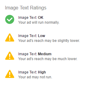
While ads whose image was more than 20% text used to be rejected, years ago they softened it to allow it to run on a “limited” basis. Typically this was noticeable in impression levels between no-text vs. low-text ad imagery, and ads were given a rating system to warn advertisers in 2016:

The 20% Text Overlay Tool
A major point of frustration was also simply knowing if you were in violation. A verdict on text proportion wasn’t given ahead of time – an advertiser would simply find they were in violation and the ad wouldn’t run.
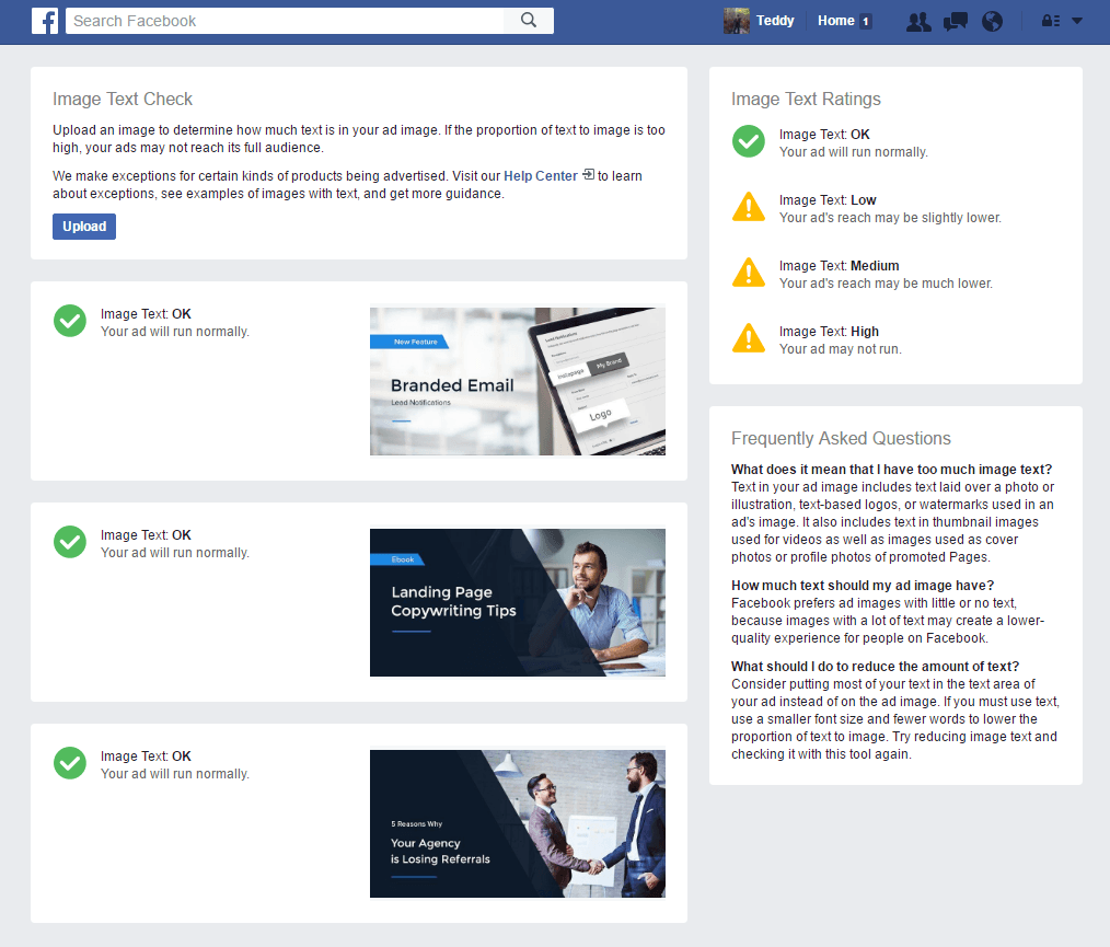
Facebook did eventually release the Text Overlay Tool, allowing advertisers to upload the images they wanted to run. The tool would then check each one, and give advertisers immediate feedback on their text situation.

Previous Exceptions to the 20% Rule
There were instances where text in an ad did not count towards that 20% threshold. These included:
- Infographics
- Covers for things like books
- A product image where it sports a text label
- Event posters
- Legal disclaimers
- Screenshots for things like apps and software
- Cartoons or comics
While no formal statement has been issued by Facebook, the updated page on text in ad imagery can be seen here.
Image 5 courtesy of Instapage
Sorry, the comment form is closed at this time.