17 Oct How to Optimize Your Blog Content for People Who Skim via @jamarketer
It’s no secret that people skim content online.
In fact, according to Chartbeat: 55% of people read your post for just 15 seconds or less.
If you’re still reading this line, you’re in the minority.
It doesn’t matter if you are ranking first for a keyword with 5,000 searches a month if half your audience leaves in 15 seconds.
Writing is just the first step, and it’s far from the last.
Now content has to be more digestible than ever.
Here is how to optimize your blog content for 55% who skim while still delighting the 45% who don’t.
1. Create Summary Graphics for Each Header
The purpose of H2s, H3s, etc, is to optimize for people that skim.
To structure your articles in a logical sense that people can quickly follow.
But, we all already do this.
And it doesn’t help skimming beyond grabbing a few simple words about what the next section entails.
Instead, take it a step further.
Don’t stop at descriptive H2s.
While those are a good start, they don’t offer enough information for people who skim.
Enter: summary graphics.
What are they? Essentially, summary graphics are custom graphics that help you summarize the key points of a section in your article.
For example, on my travel blog I do this for each major section to optimize for people who skim, which is most people online:
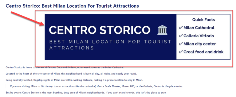

This allows users to breeze through the post if they want, gaining valuable insights in a flash.
While my goal is always to keep people reading content, it’s simply unrealistic to expect everyone to read every single word.
It’s never going to happen.
So instead of thinking that “just writing better” can solve your problems, optimize for skimming with summary graphics.
Not only will you please loyal readers with stunning visuals, but you’ll also cater to those who don’t have time to read your entire post.
And we all know how valuable good user experience is for both SEO and your brand perception.
2. Keep Intro Paragraphs Short & Sweet
Most people get carried away with introductions.
Tons of intros can feel like their own main section of an article.
I’ve seen it all from images to study break-downs within an intro, and it simply doesn’t make sense.
Data shows that people skim.
So, what do you think they are skimming first?
Most likely it’s your intro.
They clicked on your content and they know what to expect.
Chances are they aren’t reading your intro and they jumped straight to an H2.
Instead of wasting your own time writing long-winded intros, follow a simple strategy like PAS – problem, agitate, solution.
For example, take a look at this intro from a recent SEJ post on why content tactics fail:
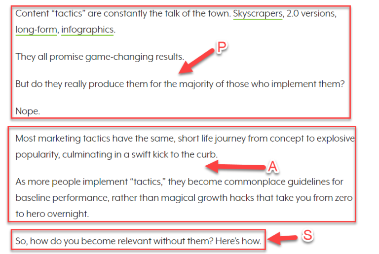

Let’s break it down.
Problem: Content tactics promise game-changing results but for most, they don’t deliver.
Agitate: Most of these tactics have a short lifecycle from results to obscurity.
Solution: Here is how to become relevant without them.
This simple intro takes just minutes to write and gives the reader exactly what they want to hear:
A problem, why it needs fixing, and how to fix it.
In addition to simple introductions that follow a structure, here are some hard-fast rules you can abide by to keep intros short and to the point:
- No images: Save them for the meat and potatoes of your content.
- No breakdowns: You shouldn’t be deconstruction any concept or complex data in your intro.
- Use a formula: For example, PAS, to keep your intros succinct and enticing.
- Word count: Keep it to 150 words or less.
- Value: Give the reader a reason to stick around by explicitly telling them how you will help them solve the problem.
Put these to work and your intros will be better to both read and skim.
3. Use a Detailed Table of Contents & Scroll to Top Button
There is nothing worse than clicking on a 5,000-word, detailed guide to see zero table of contents.
And if there is, it’s usually just H2s.
The problem here is usability.
If someone is looking at a lengthy guide, they need a detailed table of contents for a good experience.
Especially if they are on mobile, scrolling can feel almost endless.
In addition, people might be searching for just one section in your guide, rather than consuming the entire thing at once.
This presents a major potential issue for your traffic and conversions.
If someone clicks on your guide and there are zero jump links, you can bet they are heading back to the SERP for a better article.
In every lengthy post that you write, include a table of contents for H2s and H3s, or important steps within each.
In addition, to optimize more for mobile traffic, add a scroll to top button that enables mobile users to jump back to the top of the page instantly:
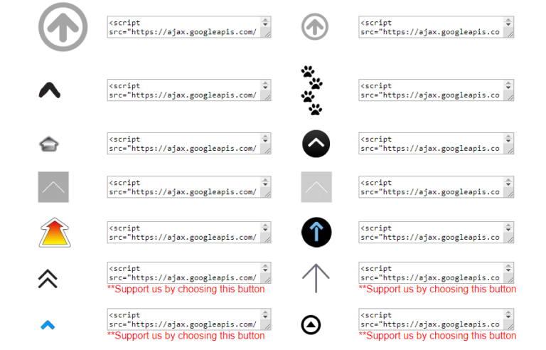

This will display in the bottom right corner of your screen, improving the mobile user experience greatly.
4. Develop Charts & Graphs for Data
Original research and data is one of the best forms of content right now to build authority.
It’s insightful, provides value, and can help you obtain high-quality backlinks from countless unique domains.
But, original research and data suck if you don’t spend the extra time to break it down into charts and graphs.
Even if you don’t have an original research blog post, charts and graphs can help users interpret complex data with ease.
In addition, those proprietary graphs and charts are link magnets just waiting to be cited on a top blog in your niche.
Plus, they are easier to create than ever before.
For example, via apps like Canva you can browse between countless graph templates:
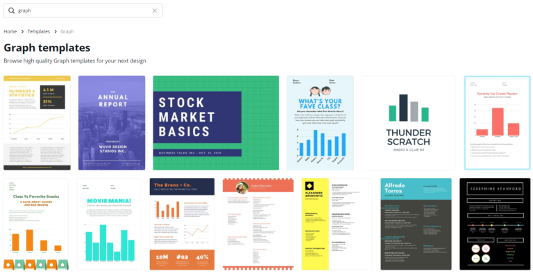

When you have the data on-hand, you can build high-quality graphics in minutes.
If creating them on your own is too time-consuming, hire someone on Fiverr or UpWork to get the job done.
As long as you include helpful (and aesthetically pleasing) charts and graphs, your content will be much easier to skim, enjoy, and credit.
Conclusion
Skimming online content is inevitable.
You likely are guilty of it, too.
I know I am.
While we can improve writing quality greatly, it’s impossible to “cure” skimming and get everyone to read every word.
Instead, we should be aiming to cater to both those who skim and those who don’t.
Use these tips to improve your blog content for people who skim, deliver a better experience, and drive more conversions from your traffic.
More Resources:
- 10 Best Readability Tools to Check Your SEO Content
- 3 Tips to Increase the Time People Spend Reading Your Content
- 9 Essential Online Writing Tools to Help Improve Your Content
Image Credits
Featured Image: Pixabay
All screenshots were taken by Author, October 2019
Sorry, the comment form is closed at this time.