17 Aug The Beginner’s Guide to Google Data Studio via @brookeosmundson
Reporting never seems to be an easy task.
In fact, most marketers cringe just at the thought of it.
As clients continue to grow, so does the sophistication of their reporting needs.
If you’re anything like me, you’re likely tired of spending hours updating the same spreadsheets each month.
Sometimes, more time is spent pulling a report than providing actual insights.
When this happens, we’re doing our client a disservice by spending more time “doing” and less time analyzing.
There has to be a better way, right?
Enter Google Data Studio reporting.
What Is Google Data Studio?
Originally introduced in beta mid-2016, Google Data Studio is a free data visualization tool.
Google Data Studio syncs all of your data sources into one reporting experience.
It enables users to create informative and visual dashboards that are easy to interpret, share, and customize.
Google Data Studio has been out of beta since 2018, meaning any user can access its immersive capabilities.
Top Benefits of Google Data Studio
Here are some of the major benefits of the Google Data Studio platform:
- Free to use. (Can’t beat that, right?!)
- Connect to (almost) any data source. (Think Google, Bing, Facebook, LinkedIn, etc.)
- A caveat with connecting properties outside of Google requires a third-party connector. Typically, these come with monthly fees (but well worth the cost). For reference, we use Supermetrics to pull in other platform data.
- Fully customizable – the ability to change reports for each clients’ needs.
- Consistent and on-brand.
- Real-time data integration.
- Saves time each month pulling reports – meaning you get to focus on actionable insights.
Convinced to give Google Data Studio a try nnow?
Great!
Let’s dive into the fundamentals.
Getting Started With Google Data Studio
There are a few key areas to ensure your first Google Data Studio report is a success. These include:
- Choosing a template.
- Connecting data sources.
- Choosing metrics that matter.
- Sharing reports.
Templates
The first thing to do is to choose a template.
Google Data Studio provides a wide variety of templates to get you started.
If you’re new to Data Studio, it is important to choose a template based on the type of data being portrayed.
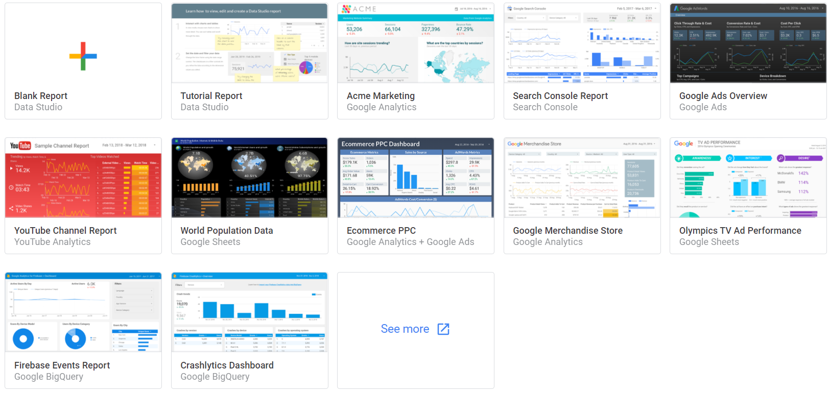

With any template, you have the ability to customize items and fonts to create a more consistent report.
The beauty of these reports is that multiple pages can be added.
Don’t feel like your entire marketing story needs to be shown on one page!
I like to start with a blank report. It gives me an open canvas to map out the data story that needs to be told.
Every client has different needs, and their reporting should be no different.
The most efficient route we have found as an agency is to create templates specific to SEO, PPC, and paid social.
With those as a standard, we can then easily tweak them based on individual client needs.
Adding Data Sources
Connecting data sources is key to a successful report build!
There are endless connectors available in Google Data Studio.
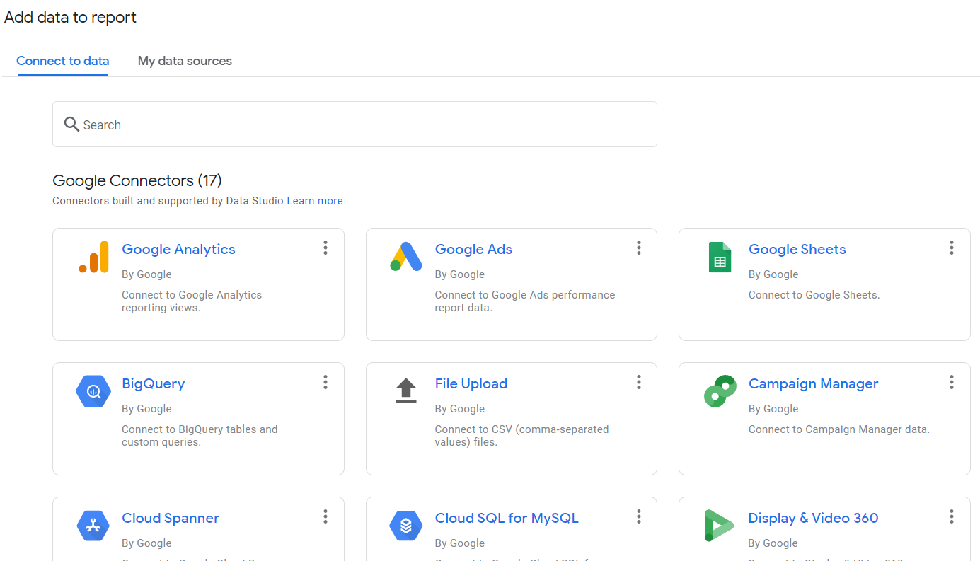

By using the connectors, it takes the manual tasks and syncs all data for you!
You can choose to add data sources at the beginning of your report build, or add them later on.
They can be found by clicking “Add Data” in the toolbar.


As mentioned above, there are many third-party connectors that can pull in additional data such as social or CRM data.
The only downside to third-party connectors that I’ve found are:
- Additional cost.
- Can slow down reports.
- Metrics are sometimes deprecated, meaning it is vital to stay on top of any changes to your report and rebuild metrics if needed.
Choosing Metrics That Matter
Speaking of metrics – they matter.
Let’s be real, the worst is when clients open reports and see a complete data dump.
While Google Data Studio is completely customizable, this does not mean we should be showing all metrics available.
Does your client care about ROAS? Be sure to include metrics such as spend and revenue.
How about overall Brand Awareness? Include pre-click metrics such as impressions, clicks, CTR, view rate, etc.
By conveying the proper metrics and insights based on goals, it shows the client that you are listening to them. A win-win for everyone!
Sharing Reports
When you’re ready to share reports with clients, be sure to review the settings.
The following options are available for sharing:
- Invite by email (user must have a Google account associated with email).
- Users can be set to “view” or “edit” permissions.
- Anyone with the report link can view.
Another cool feature Google added once the platform came out of beta was the options to limit sharing in the following options:
- Prevent editors from changing access and adding new people
- Disable downloading, printing and copying for viewers
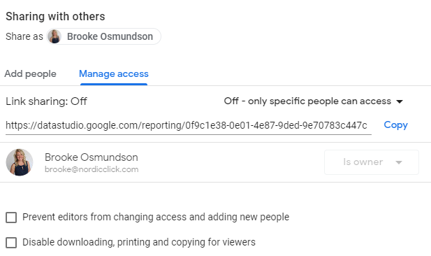

As an agency, we typically check those boxes.
By doing so, it allows us to maintain control of the report settings and integrity of report changes.
How to Build & Edit a Report
Now that the basics have been covered, it’s time to build your first report!
You can dictate the time frame of each dashboard, either individually or at the report level.
We’ll dive deeper into that later.
Choosing Proper Visuals
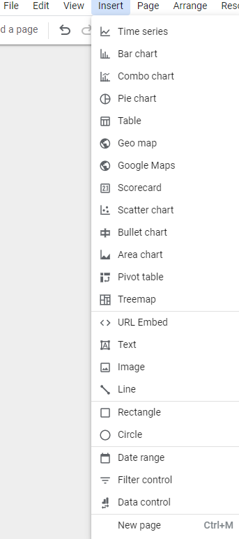
The first step is to select the data visualizations you’d like to use.
By navigating the toolbar to “Insert”, you’re able to choose from a vast selection.
These include (but are not limited to):
- Time series
- Bar chart
- Pie chart
- Tables
- Scorecards

Let’s review this Google Ads template.
I’ve labeled the four sections below to dissect what these are and how to use them.
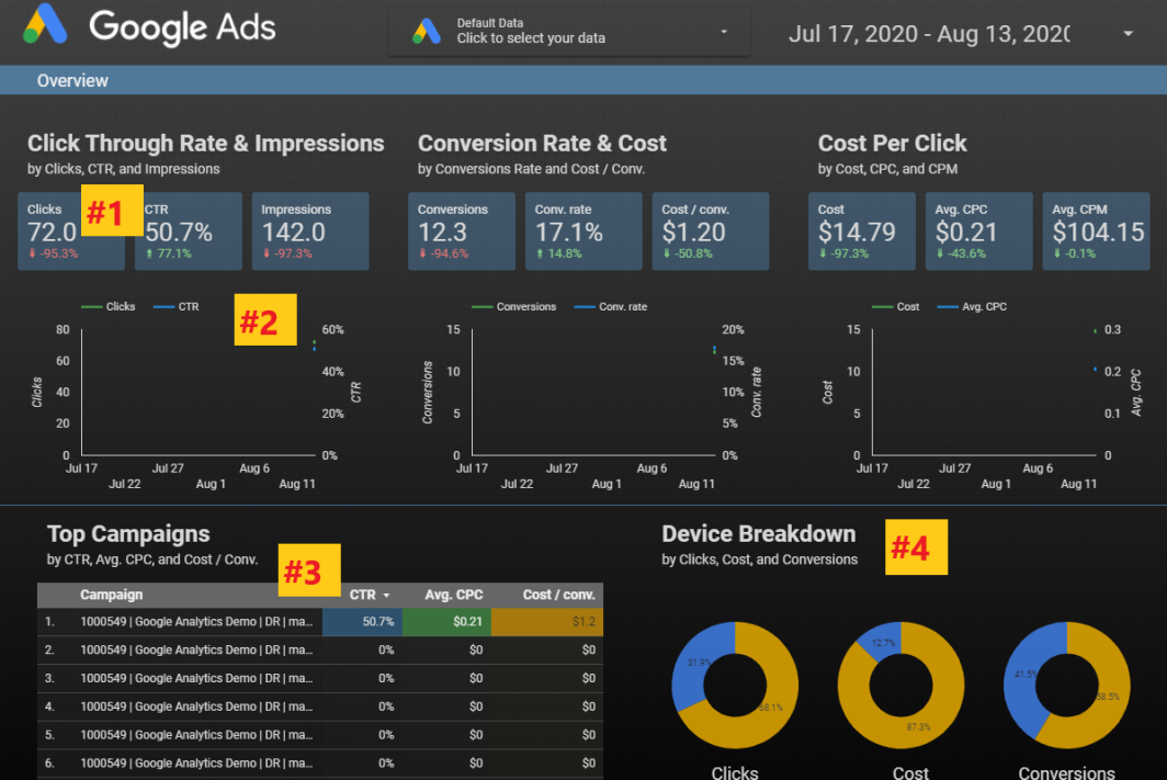

1. Scorecard
This data portrays a single metric taken from a data source.
Based on the source, you are able to choose from many options.
In this case, the template shows three different scorecard metrics:
- Clicks
- CTR
- Impressions
The scorecard metrics above also show comparison changes.
This is an option that you could include or exclude.
Again, customization for the win!
2. Time Series
The visualization here shows the change in Clicks and CTR over a set period of time.
3. Table
This is a common visualization used in reporting dashboards.
Tables allow you to drill down to campaigns, ad groups, etc. and customize the metrics shown within the table.
4. Pie Chart
The pie chart visualization is another great tool to showcase comparisons between data points.
This example uses three different pie charts to showcase differences in clicks, cost, and conversions.
With all of these features, you have the ability to customize the overall look of the report.
Editing Data Formats
The ability to choose the look and feel of a report is a game-changer for clients.
It gives a sense of consistency across an organization.
To edit the format and style of a visualization, the chart (or scorecard, table, etc.) needs to be selected.
The Google Data Studio editing pane is on the right.
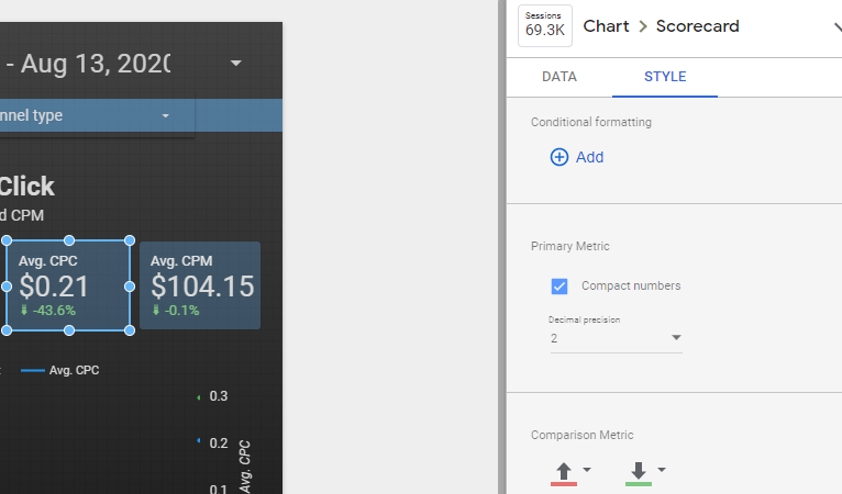

In this example, I have chosen the “Avg. CPC” scorecard. The “Style” is selected on the right.
A few ways to personalize this scorecard include:
- Font and background color.
- Changing comparison metric colors.
- Text padding to align either left, center,
- or right.
Pro tip: If you want to change all scorecards at once, simply select all at the same time.
The style changes will apply to all selections. Another time-saver!
Adding Report Filters
An efficient way to group multiple visualizations together is by adding report and page filters.
For example, if you wanted all tables and charts to change when editing the date range, you could add a Date Range icon and set it to “Report Level”.
This means that if the report is comprised of multiple pages, whenever the date range is updated all chart data updates alongside it.
If you wanted to dive into Device Type performance, there’s a filter for that!
Simply navigate to Insert > Filter Control and add the dimension of “Device” as your filter.


How about reviewing data by network type of Search, Display or YouTube?
You got it – there’s a filter for that.
In this case, simply choose “Advertising Channel Type” as your dimension when adding a filter.
Example Use Cases
You’ve now seen the platform and how to personalize each visualization to fit the report needs.
Let’s review a few use cases for common dashboards.
Website Traffic Overview
A common dashboard to use with clients is a Traffic Overview page.
Whether you only work in the PPC or SEO space with them, it’s important to keep a pulse on a high-level overview of website health.
By reviewing website traffic at a high level, it can provide additional insights that you may not have noticed.
The example below is a dashboard created with multiple visual elements.
This helps us communicate the following:
- Overall traffic up or down.
- Conversions trending.
- User behavior trending (time on site, etc.).
- Traffic and conversions by device type.
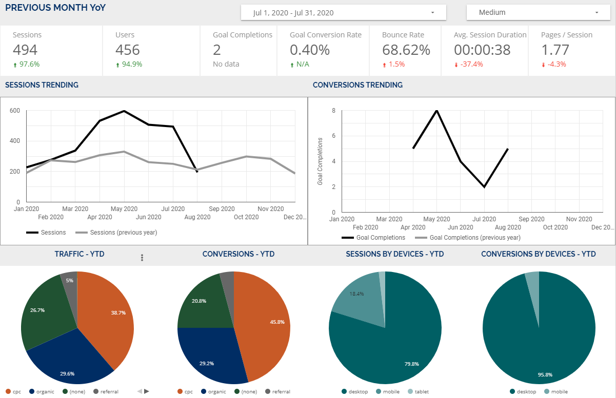

Simple illustrations can go a long way in storytelling.
PPC Campaign Performance
At a high level, this Google Ads template efficiently portrays the highlight of what matters most to the client.


Search Terms Report
We like to dive deep into user behavior with our clients.
A way to share this information with them is by showing a search term report.
It’s been helpful for clients to understand how a user is searching to trigger ads.
It can also help identify any potential gaps for messaging, product marketing, etc.
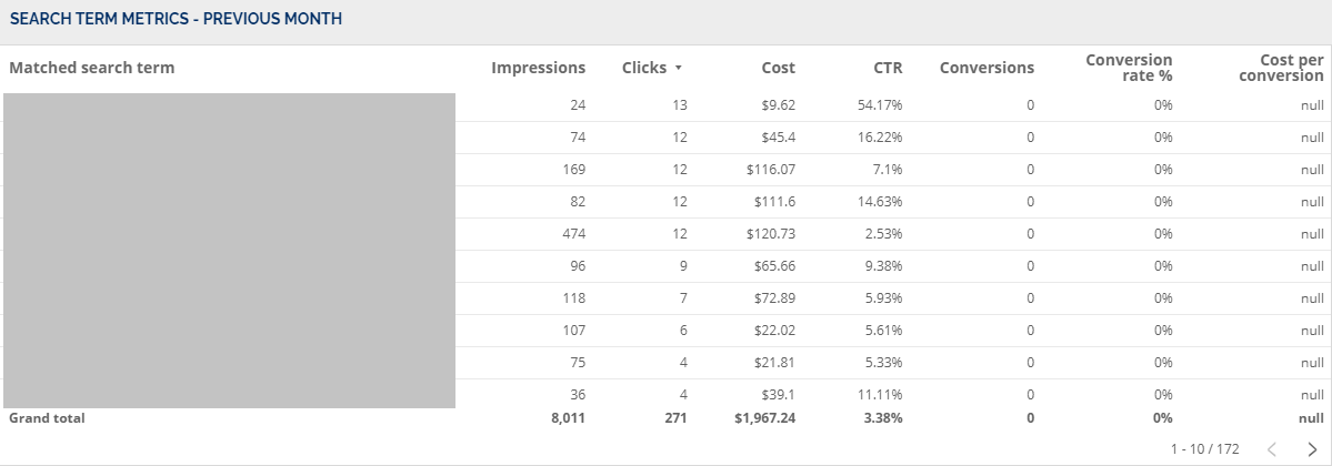

Building a custom report is no small task.
The initial set-up can be time-consuming, but the end result is well worth the effort.
Get Started with Google Data Studio Now
Hopefully, this introduction to Google Data Studio empowers you to feel more confident in creating personalized reports for your clients and brands.
More Resources:
- 12 Essential Data Studio Visualizations for Paid Search Marketers
- How to Build Speed Dashboards in Google Data Studio
- How to Take Search Console to the Next Level with Google Data Studio
Image Credits
All screenshots taken by author, August 2020
Sorry, the comment form is closed at this time.