25 Aug The Best 404 Pages: 37 Examples You Need to See via @annaleacrowe
An epic 404 page likely isn’t going to win your business any awards. I get it.
But it shows that you care about your customers.
A great 404 page can be a smart way to show off your brand’s personality.
But is it worth it to invest in a fancy 404 page?
It can be.
Because when users land on your 404 page, they aren’t finding what they needed.
Using links, smart graphics, and witty copy can make them forget that you (maybe) messed up and get them back on track.
In light of the importance of 404 pages, what follows is a list of 37 of the best examples of 404 pages that you can find online.
Before diving into the examples, let’s take a moment to review the basics of a 404 page.
What Is a 404 Page?
A 404 page is a landing page that tells your site viewers the requested page is unavailable or, in some cases, doesn’t exist.
A 404 error tells users the page cannot be accessed – and it can be a major problem.
When users can’t access a page, they can’t find the information they need.
It also tells Google that your site offers a poor customer experience, which can result in less traffic and lower rankings.
Ideally, site visitors would never land on a 404 page, but the reality is that they do happen from time to time – even from well-maintained sites.
Why Might a Visitor Land on a 404 Page?
Why might a user get a 404 error?
There are several reasons, which include:
- The server is down.
- The page moved and wasn’t redirected.
- The page never existed.
- The user typed the URL in wrong.
- The URL is broken.
Basically, if a user tries to visit a page that cannot be found, they’ll be sent to your 404 page.
What’s the Point of Making a 404 Page That Stands Out?
A visually appealing, user-friendly 404 error page shows customers that you care about their experience and are interested in keeping them on your website.
When done well, a good 404 page helps users forgive you for the error (even if it was their own fault by typing the URL in wrong) and keeps them on your site.
A great 404 page can make users smile and – most importantly – help them find what they are looking for.
We reviewed dozens of 404 pages to find the best ones that show off brands’ creativity and personality.
Here are 37 of the best examples of 404 pages done well.
1. Disney
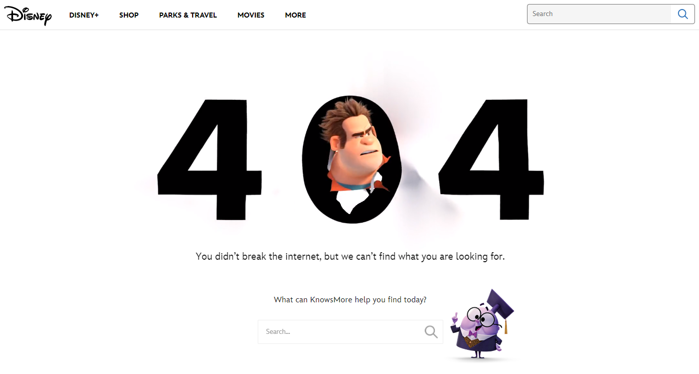

Disney knocks it out of the park with their 404 page by highlighting one of the most popular characters known for destruction – Wreck-it Ralph.
They also feature KnowsMore, a side character in Ralph Breaks The Internet.
Both characters are appropriate for the 404 page, but notice what is right next to KnowsMore: a little search bar.
There’s another one at the top of the page, but this one is dead in the center where users will see it. This search bar keeps users on-page by helping them find what they are looking for.
2. Drift
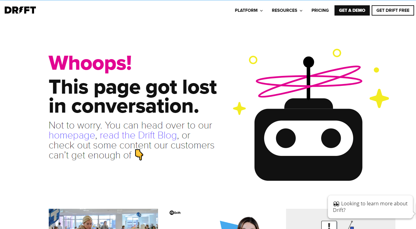

Drift is a conversion marketing tool and sales platform that offers tools for live chat, landing pages, and more.
The copy on their 404 page stays on-brand by mentioning “conversations,” but also works to keep people on the Drift website by offering links to their homepage, their blog, and links to a few of their most popular pieces of content.
In the upper right corner, they also offer a path to conversion by providing the Get Drift Free button.
3. Help Scout
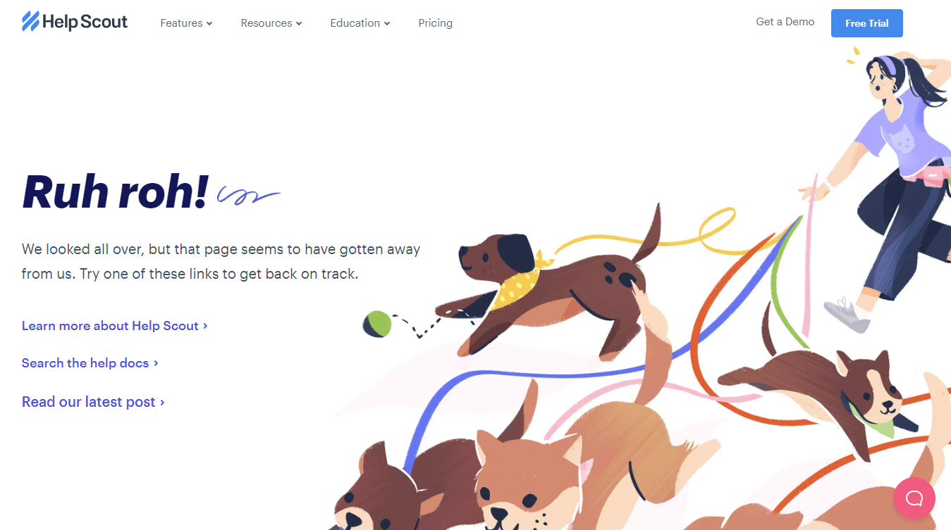

Help Scout provides companies by providing tools for help desk software, email-based customer support, and online knowledge bases.
Like Drift, their 404 page offers links to their blog and other posts, but they use a cute graphic of cute dogs to keep people smiling.
4. Apartment Therapy


Apartment Therapy, a home decor site, keeps it light by joking that washi tape (a popular paper tape used in decorating and scrapbooking) can’t fix the broken link.
Just below the fold, they link to several popular posts to keep site visitors engaged.
They also included a search bar and their main nav bar so users can continue to explore the site.
5. CoSchedule
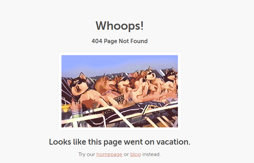

CoSchedule, a marketing scheduling tool, keeps it simple with a cute dog GIF and links to their homepage and blog.
This example just goes to show you don’t have to drop big money to create an engaging 404 page.
It’s simple, but does the job.
6. Sprout Social
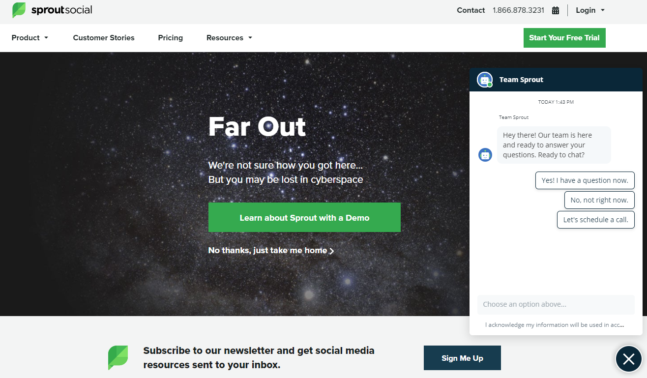

Sprout Social, the social media marketing tool, really wants to keep its customers on-page.
They start with a tongue-in-cheek reaction to landing on the wrong page – but they also push a free demo, while the home page link takes a back seat.
Then, their chatbot pops up to find out what you need.
At the bottom, they promote their newsletter.
Essentially, they’ve turned their 404 page into a landing page.
7. ConvertKit
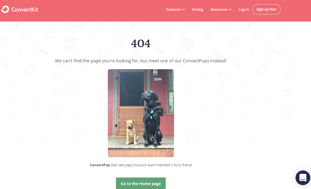

Who doesn’t love dogs?
ConvertKit keeps it light by offering a photo of a team member’s dog and a link to their homepage.
But, they also keep it professional by providing their online chat and a CTA to sign up for free.
8. Screaming Frog
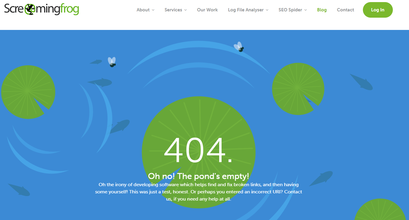

Screaming Frog is a tool designed to help site owners find and fix broken links – and they acknowledge the irony of having a 404 page by poking a bit of fun at themselves, then offering links to their blog, contact page, and services.
Unlike the other 404 pages on the list, this one isn’t static.
The flies move around the page, the fish float, and the lily pads spin.
It’s a small change, but it makes the page feel well thought out.
9. Moz


Moz keeps it simple with a cameo from Roger Mozbat, the brand’s mascot.
His presence is on brand and an easy way to make most people smile.
Moz also gives you a site search bar so you can find what you are looking for.
10. BigCommerce
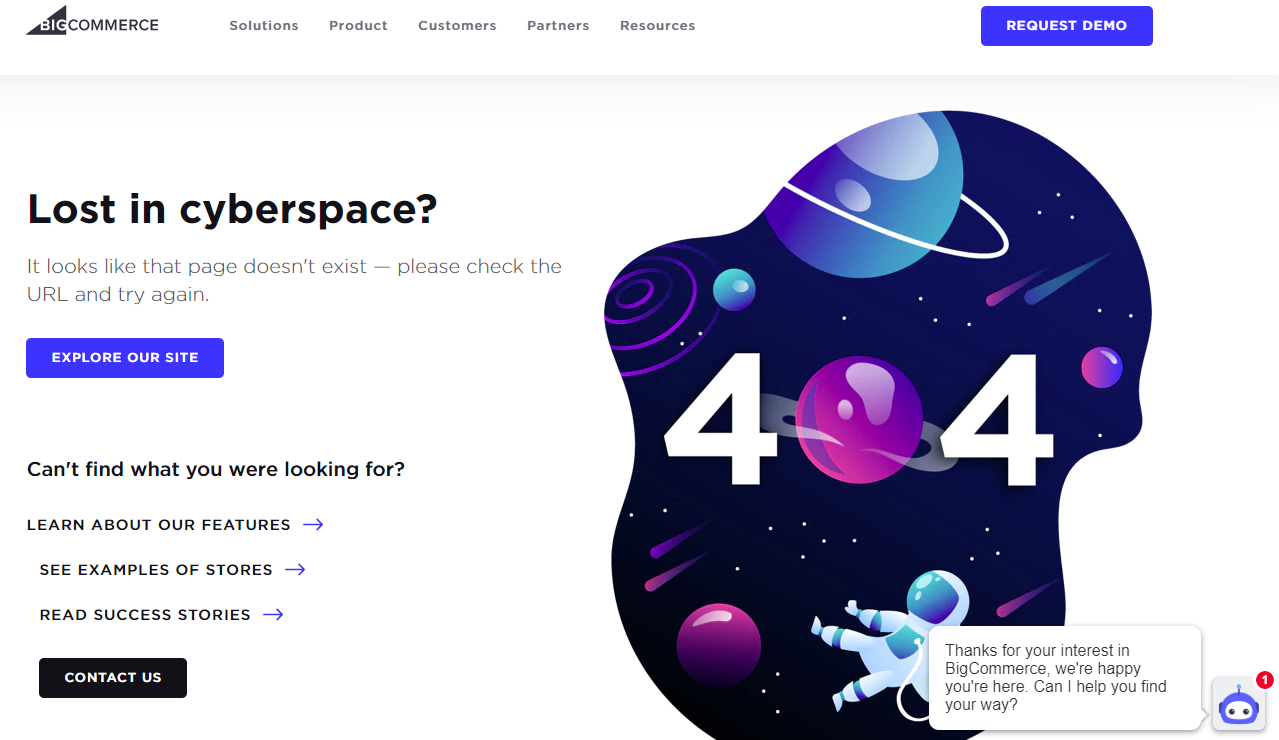

BigCommerce’s 404 page offers many of the same features we’ve seen before – the CTA to contact, request a demo, and an easy way to explore the site.
But what stands out is the well-designed outer space image, which makes the page feel thought-out and planned.
There’s a good chance that users who land on your 404 page are going to be annoyed – a creative graphic helps it feel like you’ve got your stuff together and this was just a small misstep.
11. Kinsta
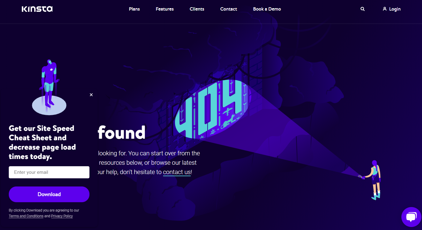

Kinsta, a cloud-based WordPress hosting company, takes a similar approach to BigCommerce by offering a well-designed image on their 404 page.
They keep their top navigation and search bar, so users can easily find other information.
They also use a pop up to suggest gated content, which likely helps drive email subscribers.
12. Lego
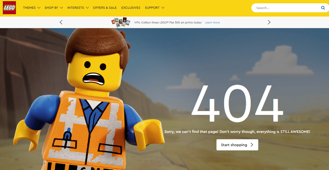

Lego keeps it light using a large image of a Lego man along with the quip “Sorry we can’t find that page! Don’t worry, though everything is STILL AWESOME!” which is a reference to a song from the Lego Movie.
They also offer a link to their shop to keep users on-site.
13. Slack
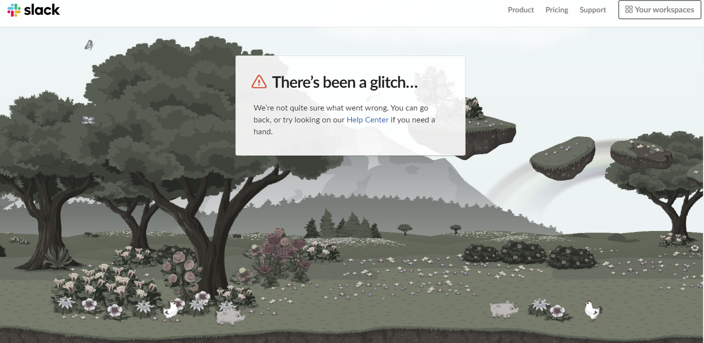

Slack’s 404 page is incredible.
The image above actually scrolls to show you a forest with flying butterflies, pigs, flowers, and chickens.
It also goes black and white if you go to another tab which, unfortunately, makes it hard to get a screenshot of the awesomeness.
Head over to their site for the full experience.
14. Mailchimp
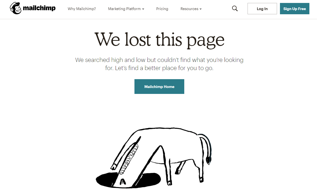

Email tool Mailchimp keeps it simple – yet clever – with their animated 404 page of an animal searching in a hole for, presumably, the page that is lost.
It’s smart and shows their 404 page isn’t an afterthought.
15. okta
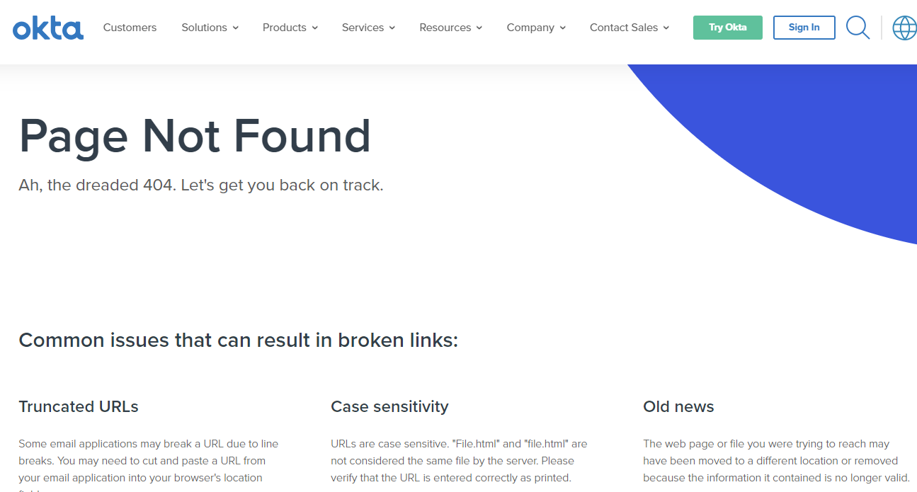

Okta is a cloud-based access management company based in San Francisco.
Their 404 page is pretty simple, but I really like that they offer reasons why the link might be broken, which helps users understand what might have gone wrong.
16. Swiss
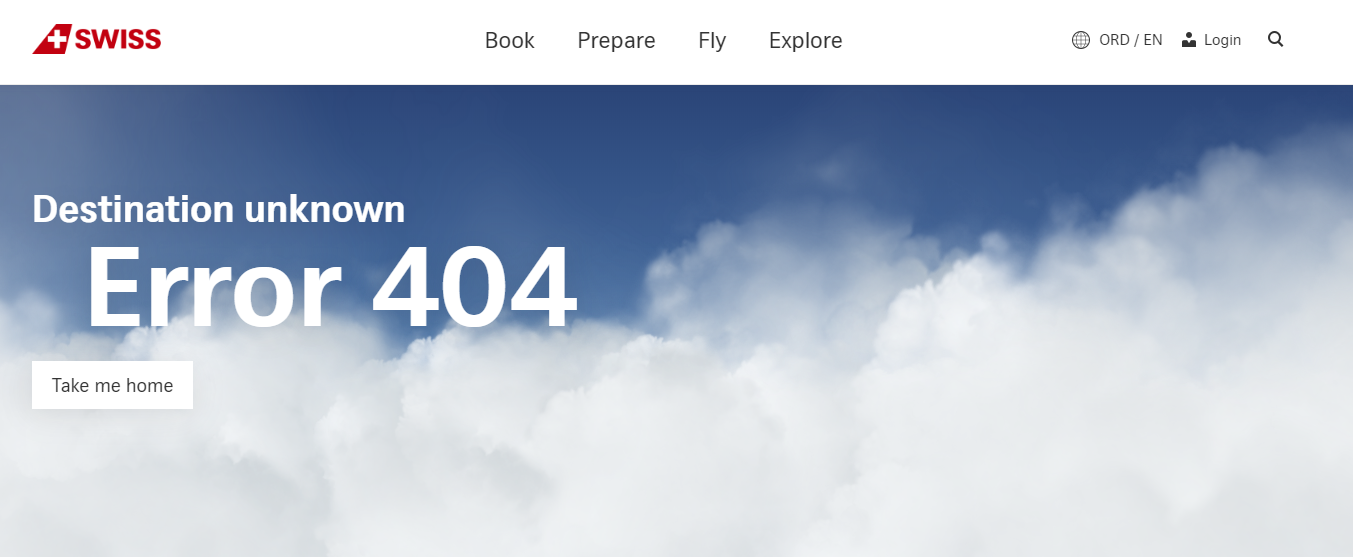

Swiss Airlines doesn’t offer any additional information, other than a link to their homepage and the navigation bar, but the image on their 404 page is really neat.
The clouds move as you guide your cursor over the page, enveloping you in clouds.
It’s an interesting feature that kept me on their 404 page longer than I’d like to admit.
17. Wizarding World
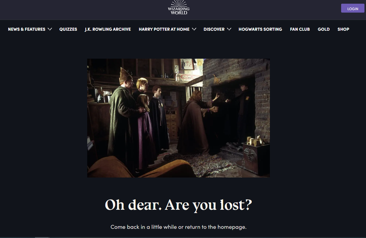

As many Harry Potter fans will know, Harry gets lost the first time he tries to use Floo powder, a glittery substance that lets wizards travel by transporting them to nearly any other house or building with a fireplace.
The image above shows the scene where Harry comes out of the fireplace where he accidentally transported himself covered in soot – making it the perfect image for a 404 page.
18. Southwest


Here’s another 404 page that made me smile – first, they use a “Star Wars” reference, which keeps it light.
The page also features a moving baton used by aircraft marshallers who direct planes on the tarmac.
Next to the image, Southwest offers quick links to help users find what they need.
It’s functional but still stands out.
19. 9GAG
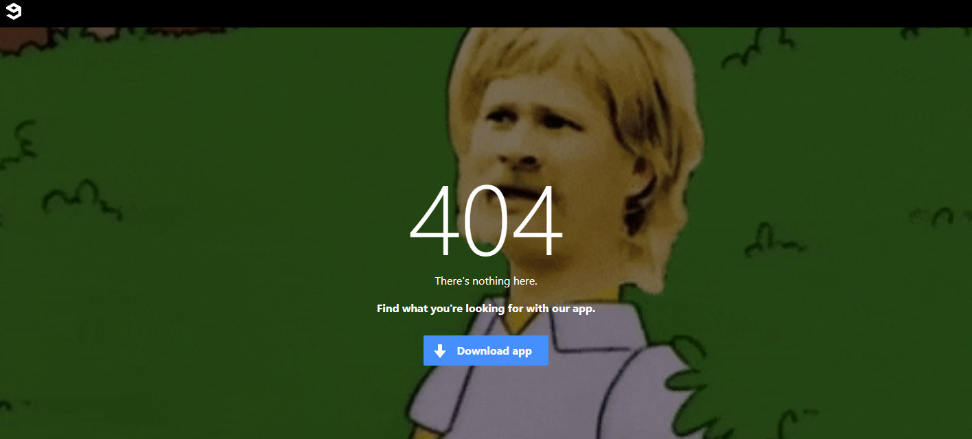

9GAG, the online platform for memes and videos, uses a totally on-brand GIF for their 404 page and offers a single link that directs users to their app.
It is simple, but staying on-brand ensures site visitors know they are on the right site, despite not finding the page they were looking for.
20. Flywheel


Flywheel, a managed WordPress hosting company, offers this quirky 404 page to let folks know they landed on the wrong page.
The casual language reflects their overall brand feel, and the link to the homepage helps users find their way.
Like several other brands, they also offer a chat function to further help users who have lost their way.
21. Dan Woodger
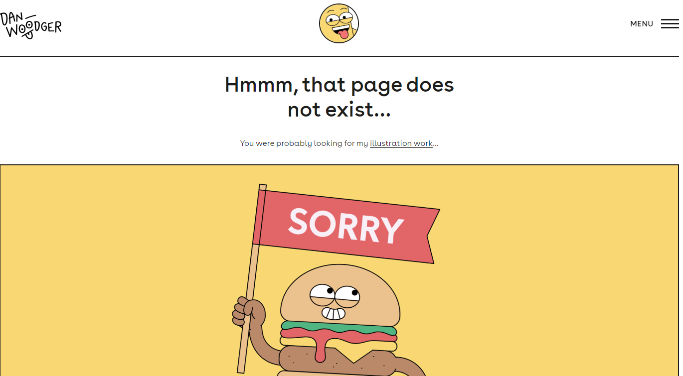

Dan Woodger, an artist and illustrator, features his own work on his 404 page. His bright and cheery hamburger is right at home.
Notice that he doesn’t mention it’s a 404 page or give any other information, other than a link to his work.
This example goes to show a great page doesn’t have to be complicated.
22. Distilled
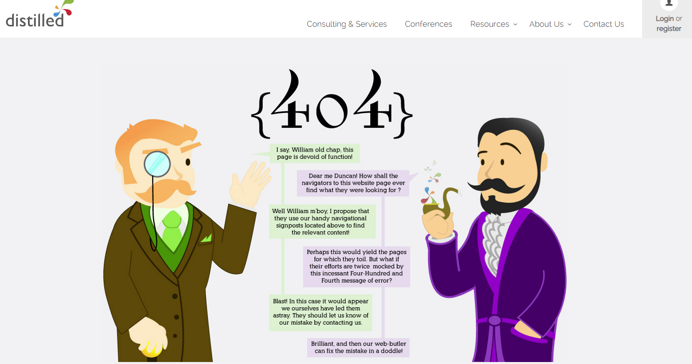

A lot of brands call in their 404 page. They figure not many people will see the page, so what does it matter.
But showcasing your brand’s style on a (seemingly) insignificant page carries a lot of weight.
If you care about your 404 page, there’s a good chance you care about your clients and customers too.
Distilled uses an infographic-like image to explain what the page is and what might have gone wrong.
23. Taco Bell
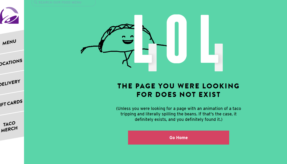

Taco Bell is known for being a bit irreverent. Their 404 page is no exception.
The page features a dancing taco who slips and spills their fillings, then scoops them back into their shell.
It’s a funky reminder that they know something went wrong.
The page also includes a link to the site’s homepage, menu, locations, and where to buy gift cards and merchandise.
24. Magnt
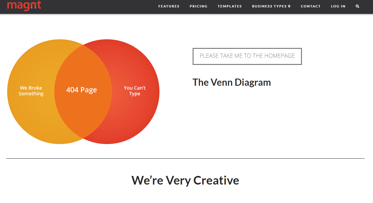

Magnt offers an easy to use builder and tools for creating sites, and they pride themselves on being better than your standard template-based website builder.
Their 404 page highlights the brand’s creativity with a clever Venn diagram that explores the reasons why you might have ended up on the page – “We broke something” or “You can’t type.”
25. Dribble
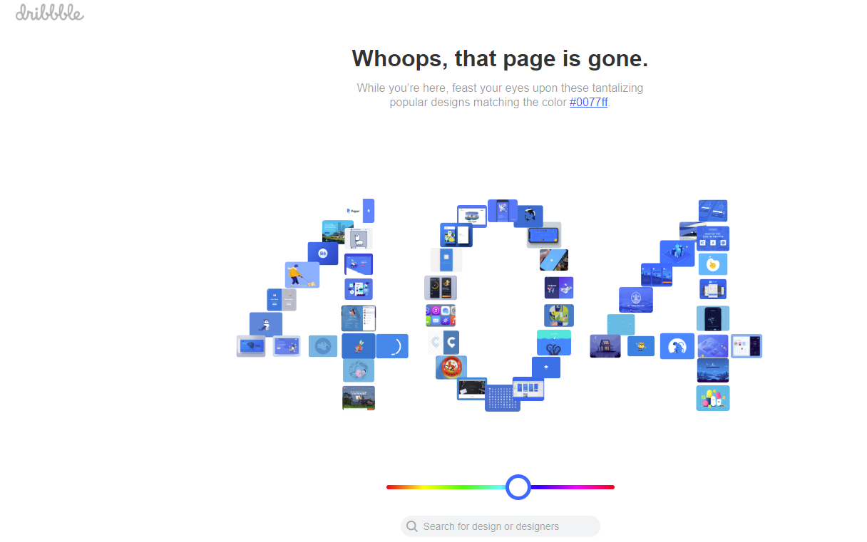

Dribble, a creative marketplace for design professionals, offers up a fully-functional 404 page.
Users can drag the dot below the 404 font to explore designers within a specific color range.
Clicking on the blocks that make up the 404 numbers takes you to those specific designers.
They also offer a search bar, for users who’d rather search the site that way.
26. Overflow
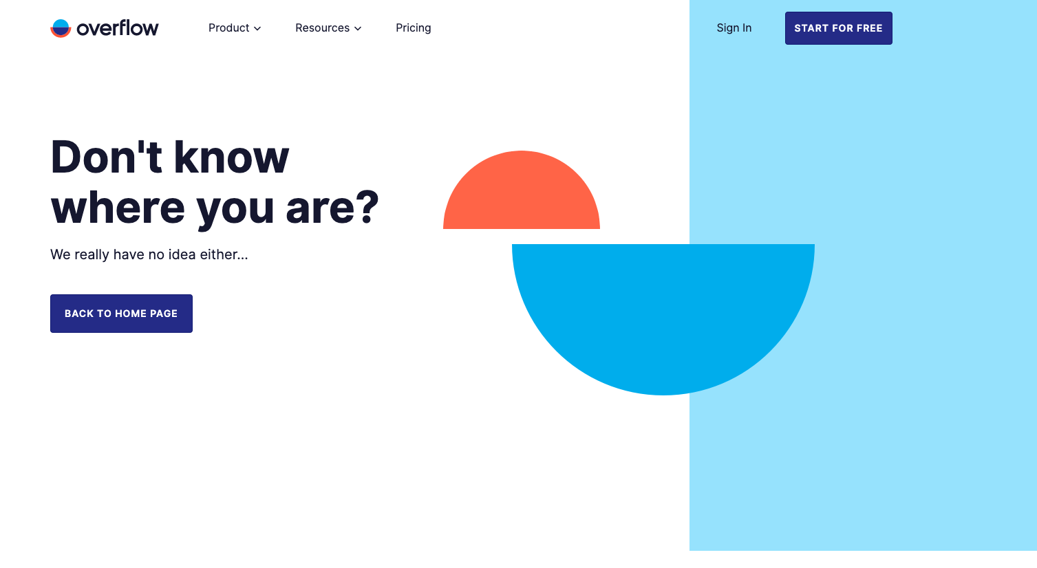

Overflow’s personality is placed front and center on their 404 page.
Their conversational tone and humor are inviting and welcoming which connects with me to want to click back to their home page.
And, the same voice and tone are conveyed on the homepage.
27. Wendy’s
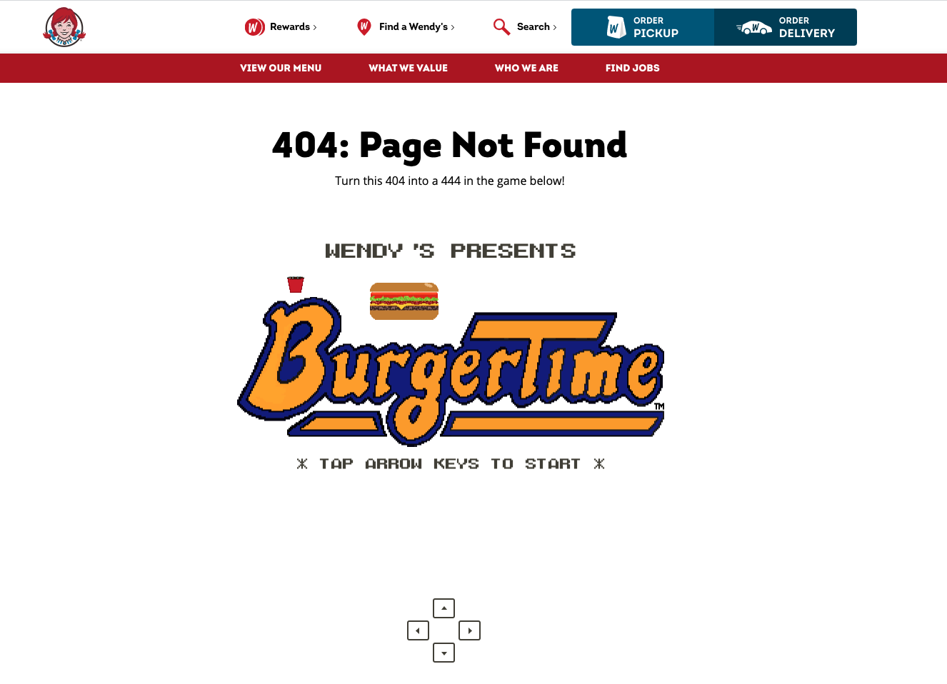

By now, you’ve probably laughed at one or two tweets from Wendy’s.
But, similar to Overflow, Wendy’s continues the same voice and tone flow to their website, even their 404 page.
They created an interactive video game for users similar to Pac-Man on their 404 page.
See if you can get Wendy to the end!
28. Red Bull
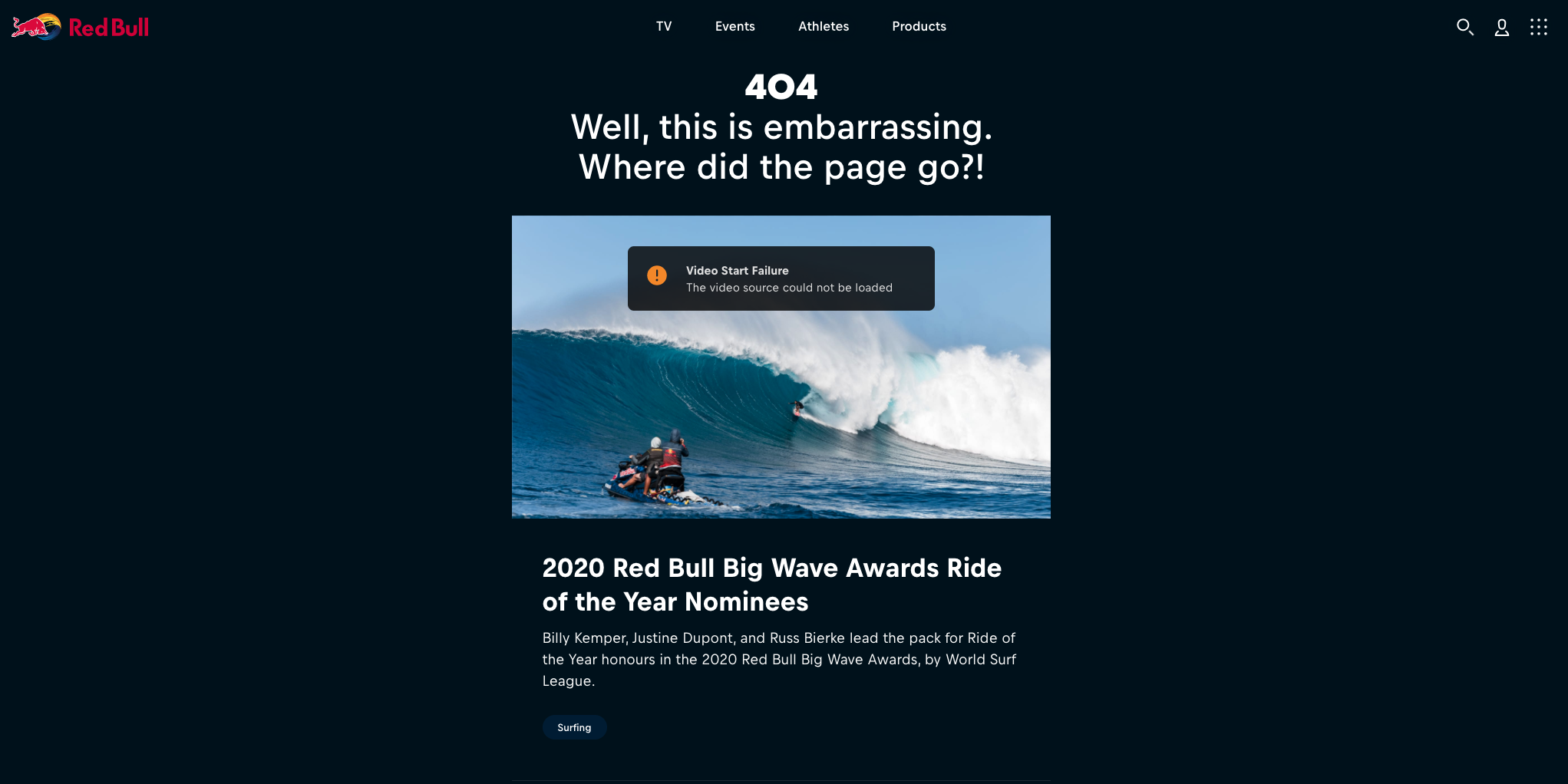

Red Bull’s 404 page is a dream for any SEO or marketing professional.
It’s jam-packed with links to articles and playlist of videos.
Red Bull even rotates the video playlist for their most recent event.
You can see from the image above, Red Bull was using their 2020 Red Bull Big Wave surfing event as the source of inspiration.
29. Blizzard


Blizzard Entertainment, the creators of World of Warcraft, also known as WOW if you’re a geek like me. 🤓
Blizzard features one of their most well-known characters, a Murloc, to help rescue you from their 404 page.
30. Marvel


Marvel utilizes its different comic book characters like Captain America, Deadpool, etc. in a rotating 404 page.
A little hint: Keep hitting refresh. Every third refresh, Marvel will serve up a different visual.
31. Patagonia


Patagonia is hanging ten on their 404 page playing up its casual, tropical vibe.
First, they engage the viewer with a video loop, but then they guide the user further down the page to links to their popular shopping categories.
32. Backcountry
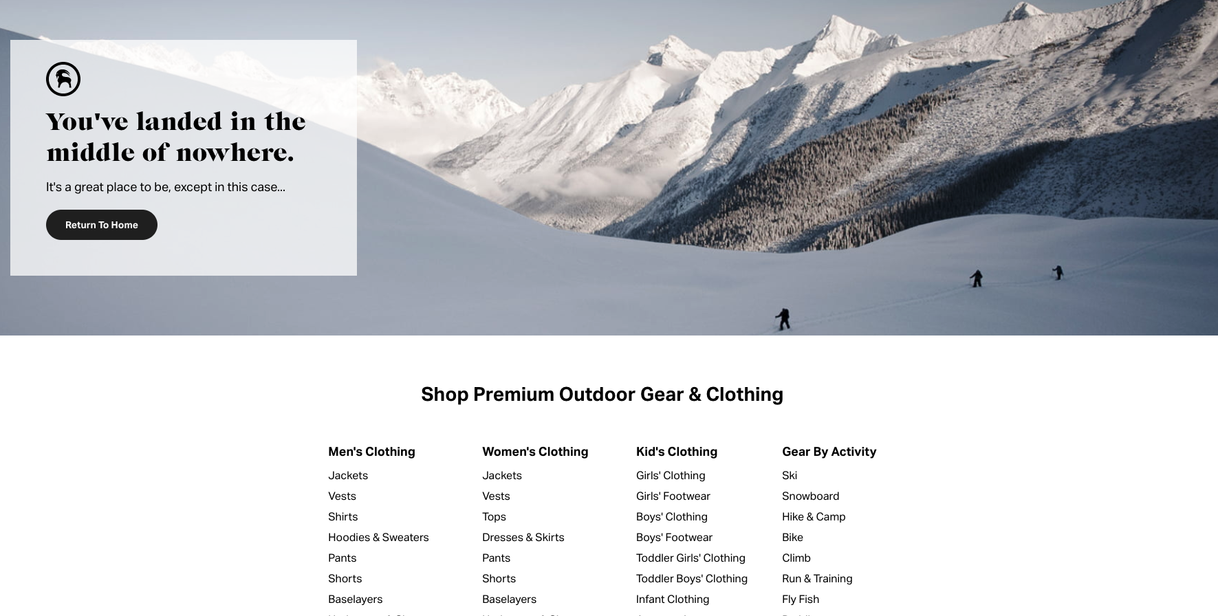

Backcountry, a popular outdoor gear website that I often spend way too much time shopping for things I’ll never buy, shows off its funny side while connecting with its audience.
33. Nintendo
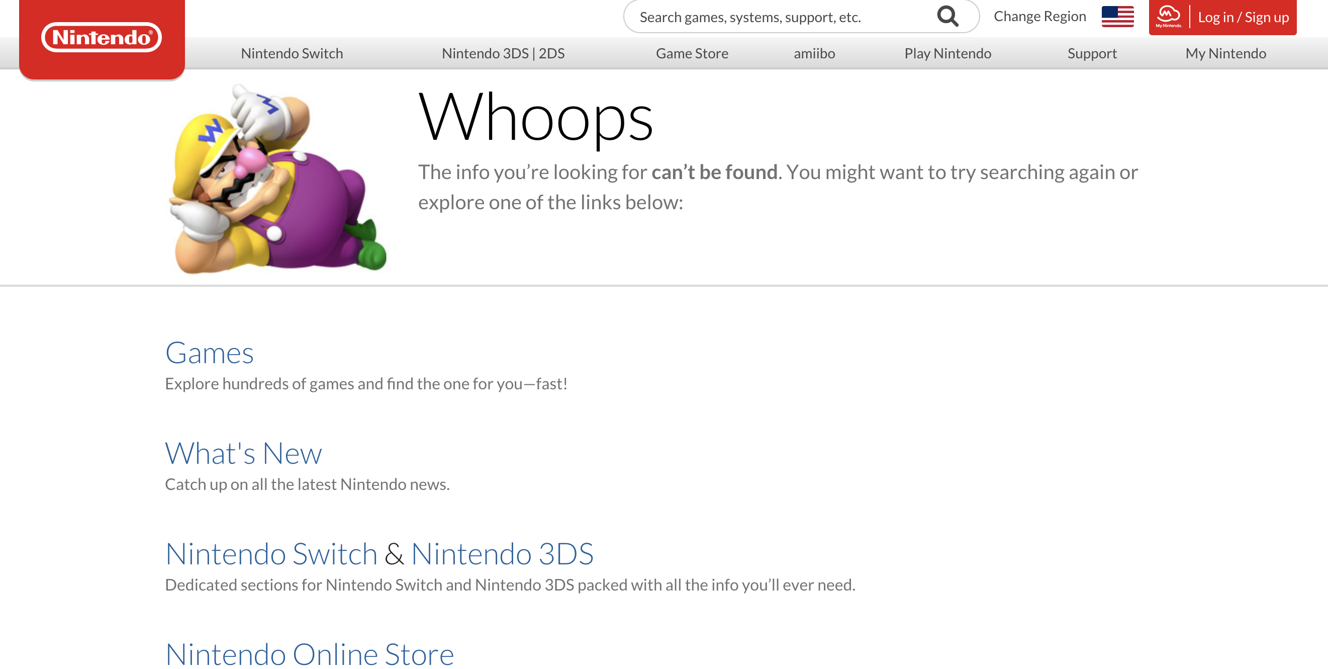

Nintendo does lack some visually engaging pieces, which I was surprised by, you know, being Nintendo and all.
But, what’s important is that Nintendo adds links for resources for the user.
It forces users to stay on the website and not bounce back to the SERPs.
34. Zillow
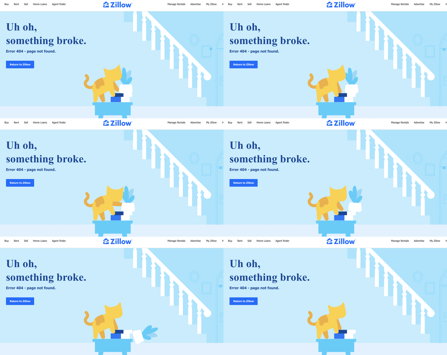

Zillow offers an interactive GIF benefit to its home searchers.
Zillow utilizes customer data to see that their users are pet lovers.
And, to keep those pet lovers engaged, they created this interactive cat that adds a little chuckle at the end when it breaks something in the living room.
As an animal lover, I can connect to this!
35. H&R Block
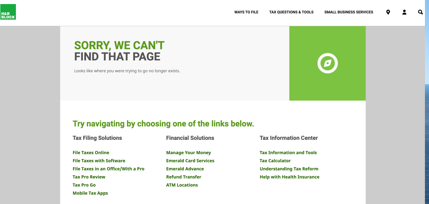

H&R Block is another look at a not-so-appealing 404 page, but it does offer more information to users to keep them clicking and engaged on their website.
36. World of Warcraft


The team at World of Warcraft acknowledges their audience’s skillset with a few jokes about CDNs and above the fold.
37. Playstation
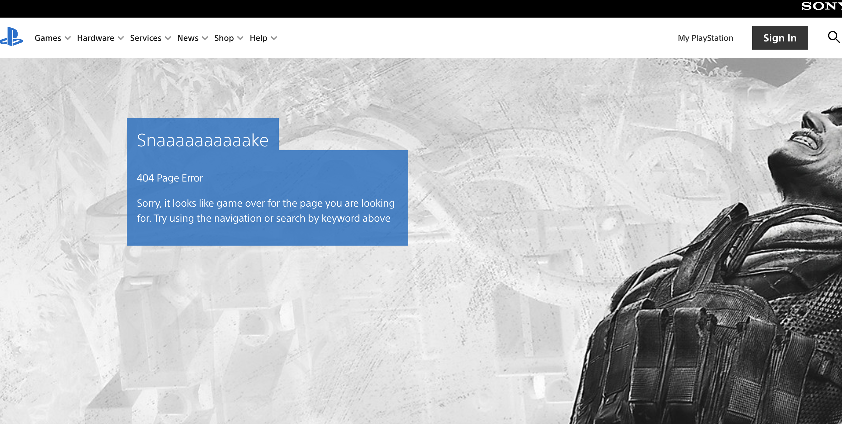

Playstation gives a nice shout out to one of its newer games on its 404 page.
Plus, they provide options to go back to the homepage or get advice from the help center.
Summary
In a perfect world, no one would ever see your 404 pages.
They would stay hidden far away, like the bag of Reese’s thins I keep hidden in my closet. You know, for drastic times.
But in the real world, things happen.
Links get truncated, fat fingers slip, and sometimes you just forget to redirect a page. Start by using a tool like Screaming Frog to find those broken links.
Remember, it takes time to create a creative 404 pages that draw users in rather than chasing them away.
More Resources:
- 404 vs. Soft 404 Errors: What’s the Difference & How to Fix Both
- How to Map 404 URLs at Scale with Sentence Embeddings
- A Technical SEO Guide to Redirects
Image Credits
Featured Image: Created by author, August 2020
All screenshots taken by author, August 2020
Sorry, the comment form is closed at this time.