14 Jul Twitter Rolls Out a Desktop Redesign – Does it Live Up to the Hype? via @MattGSouthern
Twitter has finally begun rolling out a redesigned desktop interface which the company has been hyping up for weeks.
“A whole new Twitter is coming,” reads a notice that was proudly broadcasted on the desktop home page.
For weeks Twitter users have been greeted with this message when using the platform on desktop:


Did Twitter deliver on its promise? Yes and no. Here’s a breakdown of the redesign.
Twitter Delivers on (Most) Promises
Twitter stayed true to its word by delivering on all promised features, and then some.
Woah, what’s this? A shiny new https://t.co/q4wnE46fGs for desktop? Yup. IT’S HERE. pic.twitter.com/8y4TMzqBGa
— Twitter (@Twitter) July 15, 2019
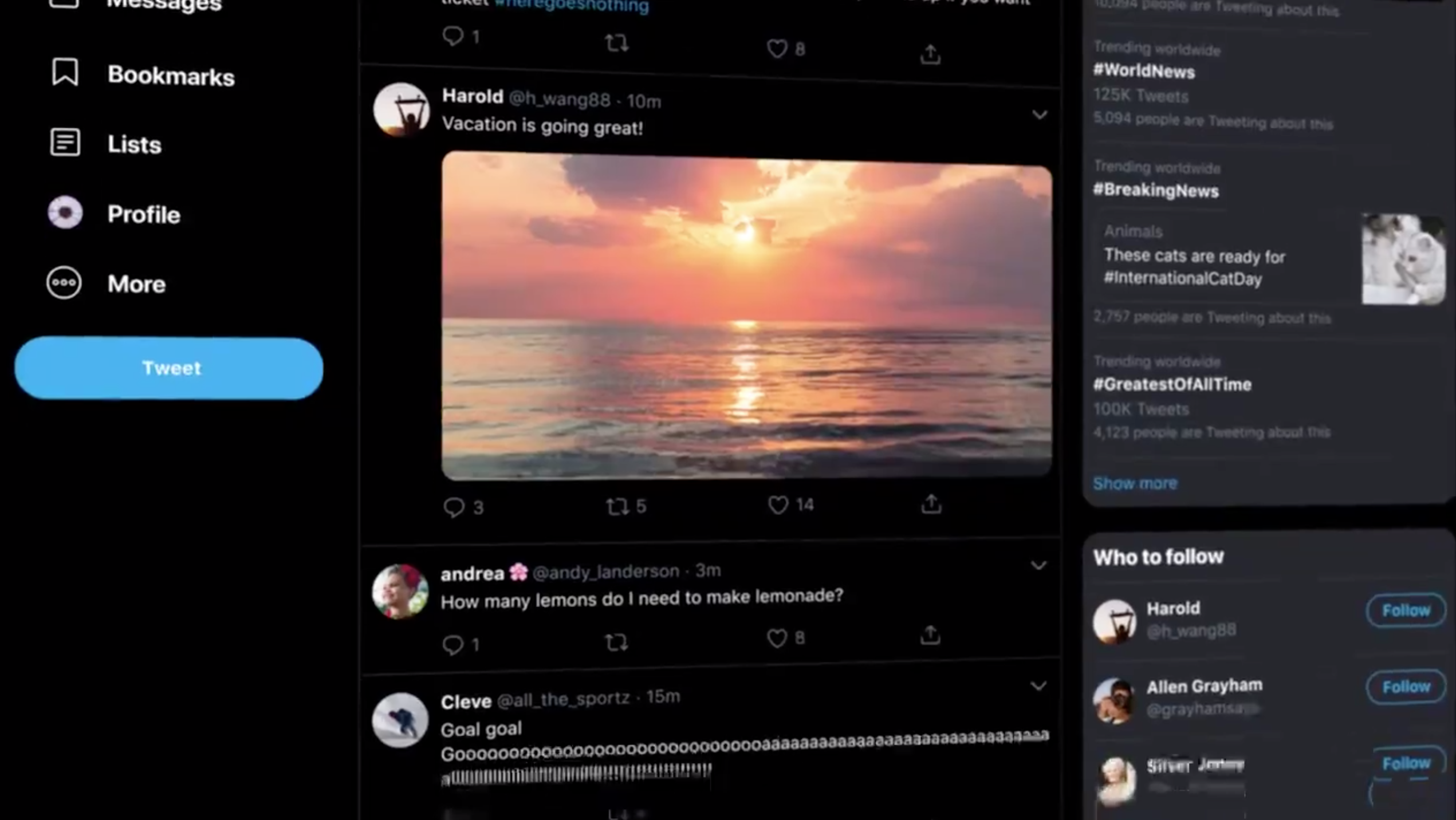
The following new features have been added to Twitter on desktop:
- Bookmarks
- Dark mode
- The “sparkle” button from the mobile app
- An ‘Explore’ page

 An example of Twitter’s new dark mode
The new design also allows users to find things faster, which was another one of Twitter’s promises.
With the addition of more items in the navigation menu, users can get to certain sections with fewer clicks.
For example, if you want to view a list you can just click on “Lists” in the navigation menu. Previously, you’d have to go to your profile and then click on “Lists.”
However, with all of that said, the redesign didn’t live up to the hype in the sense of being “A whole new Twitter.”
For the most part, the redesign is just a rearrangement of the previous version of Twitter.
Navigation has been moved from the top to the far left side of the screen. Trending topics have been moved from the left to the right side of the screen. There’s a new section for DM’s. Little things like that.
I’d argue it doesn’t feel like a whole new experience, rather, it’s a more refined version of what we already had.
Sorry, the comment form is closed at this time.