20 Oct WordPress Gutenberg 9.2 – Dozens of Improvements via @martinibuster
WordPress Gutenberg 9.2 is here and it comes with a security fix and many improvements, bringing Gutenberg closer to being a fully developed way of creating web pages.
Security Fix
This security fix addresses a particularly nasty form of attack called a Regular Expression Denial of Service (ReDoS) attack. A ReDos attack causes a server to overload CPU usage, bringing the server to a halt.
Image Alt Text Fallback
The next notable change is to add an alt text fallback for when no alt text is specified. Gutenberg will use the caption as the alt text.
It’s arguably not an ideal solution because that means a screen reader is going to repeat the same phrase twice.
The alt text should ideally be a unique description of what the image is, which should be different from what’s in a caption.
According to the description:
“The image caption is set as the alt text where there is none supplied.”
Support for Video Subtitles
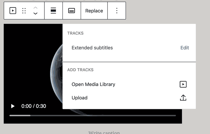
Gutenberg 9.2 adds support for adding video subtitles, which is a pretty cool feature. The video media workspace now includes a dropdown that provides an option to add subtitles.

Information Panel Design Update
There is an update to the way an info panel appears. The info panel is a toggled display of statistics of the current document, such as the character count, words and headings used.
This is a UI improvement, but also a stopgap until a final version is created.
Screenshot of the Improved Info Panel
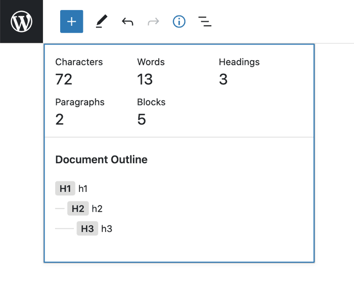

The design of that info panel is a columns view. A column type display is horizontal (left to right), as opposed to a row based display that is more vertical (up/down).
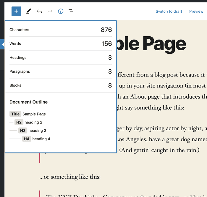
The info panel is still undergoing design changes and is scheduled to ultimately become a more row-based approach referred to as a list view.
Below is a screenshot of the still in-development version of the info panel.
Screenshot of In-development Info Panel

WordPress Template Details Dropdown
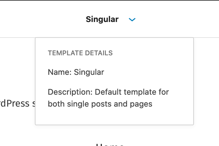
There’s also a new template information dropdown that provides a name and description of the template in use. It’s accurately described as a “very basic template information dropdown.”
Screenshot of Very Basic Template Info Dropdown

Relatively Minor Improvements
Rename “Options” modal to “Preferences”
This is a UI improvement that clarifies a sidebar menu system, where it has top level sections of View, Editor, Tools and Options, with the Options section being renamed to Preferences.
There are numerous improvements like this that I’m leaving out. They’re important but on the level of how the automatic locks in your car function.
Improvement to Column-Based Layouts
This change is an improvement to the process of making column-based layouts. It adds the ability to create a single-column block.
Screenshot of Newly Available Single-column Layout Option
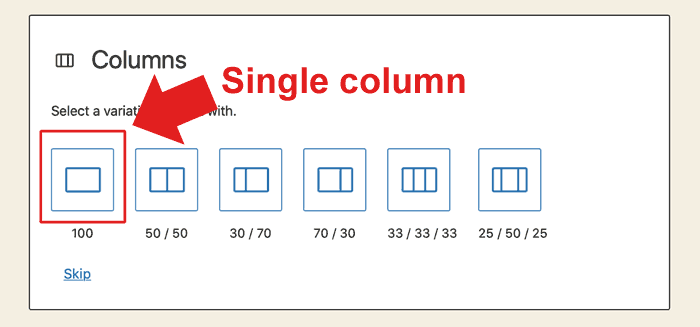

The ability to add a single-column section to a layout is important. It’s a common feature in WordPress builders like Divi. So it’s a welcome addition to Gutenberg that extends its ability to create beautiful WordPress layouts.
Screenshot of a Single-column Layout Section Output
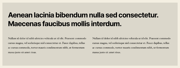

According to the WordPress developers:
“This …will make building more robust column-based layouts easier. Instead of relying on switching between using Columns and Group blocks, single column functionality within a Columns block makes building interesting layouts easier and faster.”
Distraction-free Writing Options
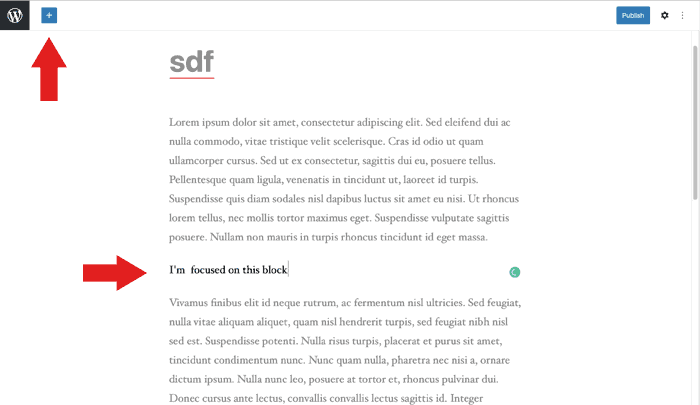
An improvement to the “spotlight mode” of content creation which hides editing tools, which adds a spotlight to the section being worked on, and reduces theme styling effects.
It’s a distraction-free editing environment that a content creator can choose.
Screenshot of Distraction Free Writing

Post Featured Image Link
This adds the ability to make the featured image a link to the article. The documentation is unclear as to whether this is for a section that lists articles where a featured image can be a clickable element.
The GitHub documentation for this section includes a question from other team members about this:
“What does the featured image link to? The post? The image itself? Can I write my own custom link?”
And there is discussion about adding options for opening the featured image in a new tab and adding a rel attribute to the link.
Ultimately it was concluded to add the least amount of features and add them in if the need presents itself because it’s easier to add features than it is to remove a feature after it was discovered to be superfluous.
The logical assumption is that the ability to make a featured image a link is for improving the UX for site visitors who may want to click on a featured image to navigate to an article.
Widgets Screen
The widgets screen has a great deal of incremental improvements, including accessibility enhancements. The accessibility improvement is to adding meaningful labels to ARIA landmarks to make them more descriptive.
According to the GitHub page:
“This tiny PR provides more meaningful names for the ARIA landmarks in the new Widgets screen by passing specific labels instead of relying on the defaults.”
New APIs and Experimental Features
Beyond the above incremental and important additions, there are more technical additions like making block supports server-side explicit, mostly under the hood type improvements.
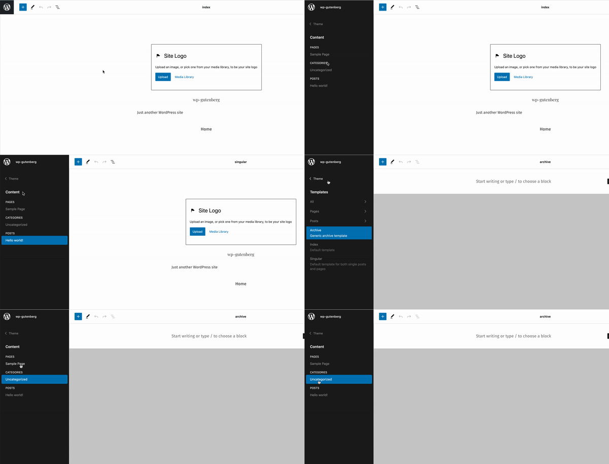
The “experiments” improvements affect the Query Block and Site Editor. They are generally UI and feature improvements to how the block interfaces work and adding basic but important options like adding “Custom Post Types support in Query block.”
Similarly, the site editor “experiments” section has improvements like adding a page switcher and template switcher option to the navigation panel.

Bug Fixes, Performance and Documentation
Gutenberg 9.2 comes with dozens of bug fixes, a few under the hood performance enhancements, additions to the documentation and code quality fixes.
Overall, these improvements are about making Gutenberg a viable way to create WordPress websites.
A number of the additions are things that are already available in modern third party page builders. So in a way, WordPress is playing catch up. Nevertheless, this is progress toward a modern site editing process.
Citations
Official WordPress announcement
Sorry, the comment form is closed at this time.